-
- Topic
- Users
- Activity
-
-
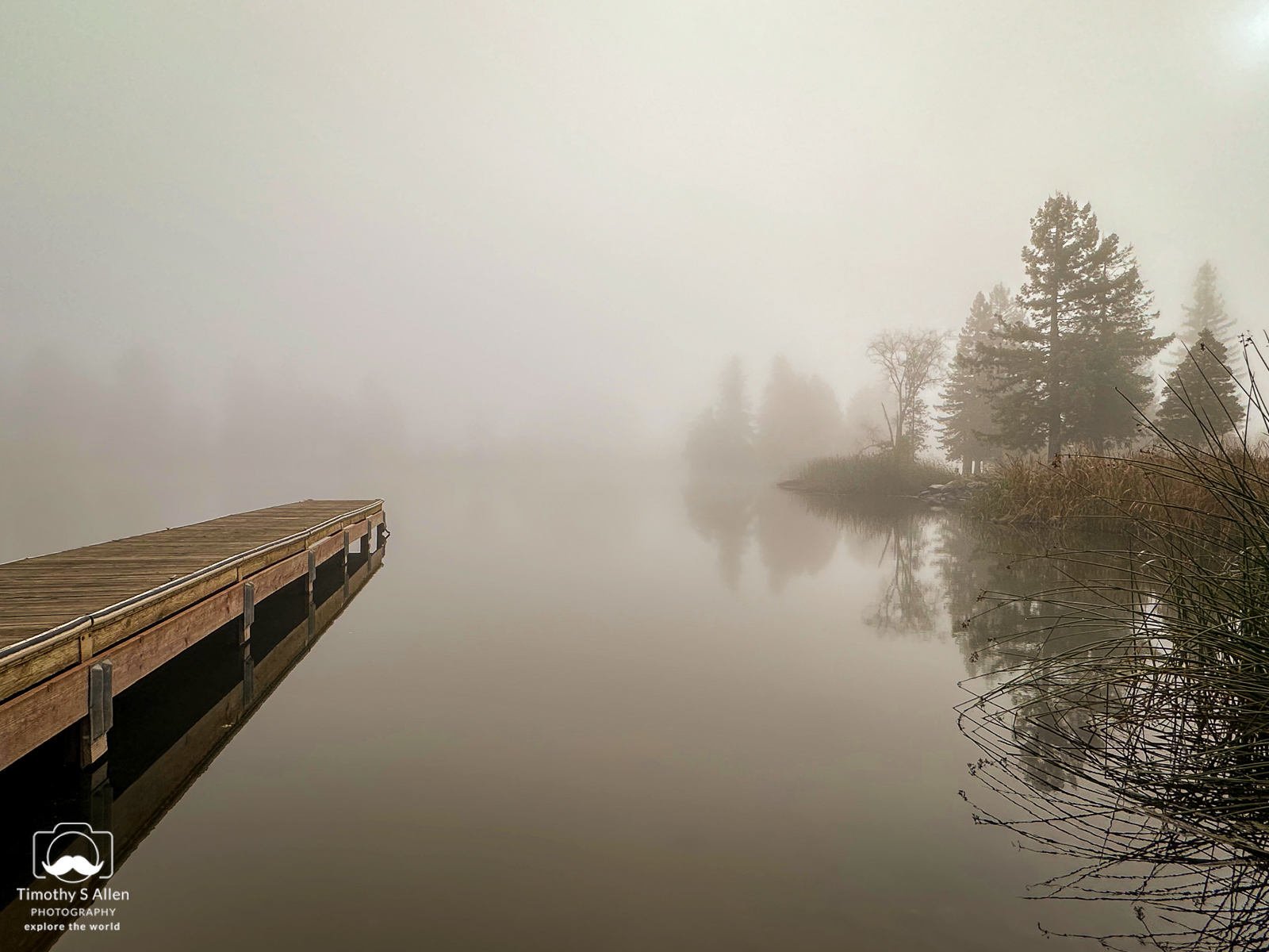
 Weekly Photography Challenge #691 Serene Waters!
Started by:
 in: Weekly Photography Challenge
- 18
- 2h, 23min ago
-
Photo of the Week – April 13th
Started by:
 in: General Photo Chit Chat
- 10
- 3h, 26min ago
-
Members Picks of APRIL 2024
Started by:
 in: Members’ Picks
- 6
- 5h, 41min ago
-
Mobile Monday Challenge
Started by:
 in: General Photo Chit Chat
- 10
- 5h, 42min ago
-
April Contest “Whispers” Now Open
Started by:
in: General Photo Chit Chat
- 3
- 5d, 14h ago
-
nets and floats
Started by:
 in: The Shark Tank Feedback Forum
- 5
- 3h, 6min ago
-
rocket
Started by:
in: The Shark Tank Feedback Forum
- 4
- 9h, 3min ago
-
RE MI DO DO SO
Started by:
in: Landscape Photography
- 5
- 9h, 18min ago
-
Cathedral of St. Paul, St. Paul, MN – Dramatic Night with Lone Star in Sky
Started by:
 in: General Photo Chit Chat
- 2
- 13h, 35min ago
-
dandelion
Started by:
 in: General Photo Chit Chat
- 4
- 13h, 39min ago
-
Can a Landscape be Vertical…
Started by:
in: Photography Throwdowns
- 7
- 13h, 41min ago
-
Converting to Macro?
Started by:
 in: General Photo Chit Chat
- 8
- 1d, 2h ago
-
Solar Eclipse – Path of Totality (Southern Illinois)
Started by:
in: General Photo Chit Chat
- 4
- 1d, 4h ago
-
Pareidolia Throwdown
Started by:
in: Photography Throwdowns
- 7
- 1d, 10h ago
-
lines of chairs
Started by:
in: The Shark Tank Feedback Forum
- 10
- 1d, 11h ago
-
Macro photography
Started by:
 in: General Photo Chit Chat
- 4
- 2d, 4h ago
-
A Pair of Sarus Cranes
Started by:
in: Members’ Picks
- 2
- 2d, 8h ago
-
A punk rocker of the insect world
Started by:
in: General Photo Chit Chat
- 3
- 2d, 10h ago
-
Solar Eclipse
Started by:
 in: General Photo Chit Chat
- 9
- 2d, 11h ago
-
The crescent moon and star at sunset.
Started by:
in: General Photo Chit Chat
- 3
- 2d, 14h ago
-
Burning technique on budding poppy
Started by:
in: The Shark Tank Feedback Forum
- 6
- 3d, 1h ago
-
- You must be logged in to create new topics.