
Photography Forums › Photography Forums › The Shark Tank Feedback Forum › First Snow
- This topic has 20 replies, 8 voices, and was last updated 7y, 11mo ago by
 Albirder.
-
AuthorPosts
-
-
October 31, 2018 at 9:25 pm #372617
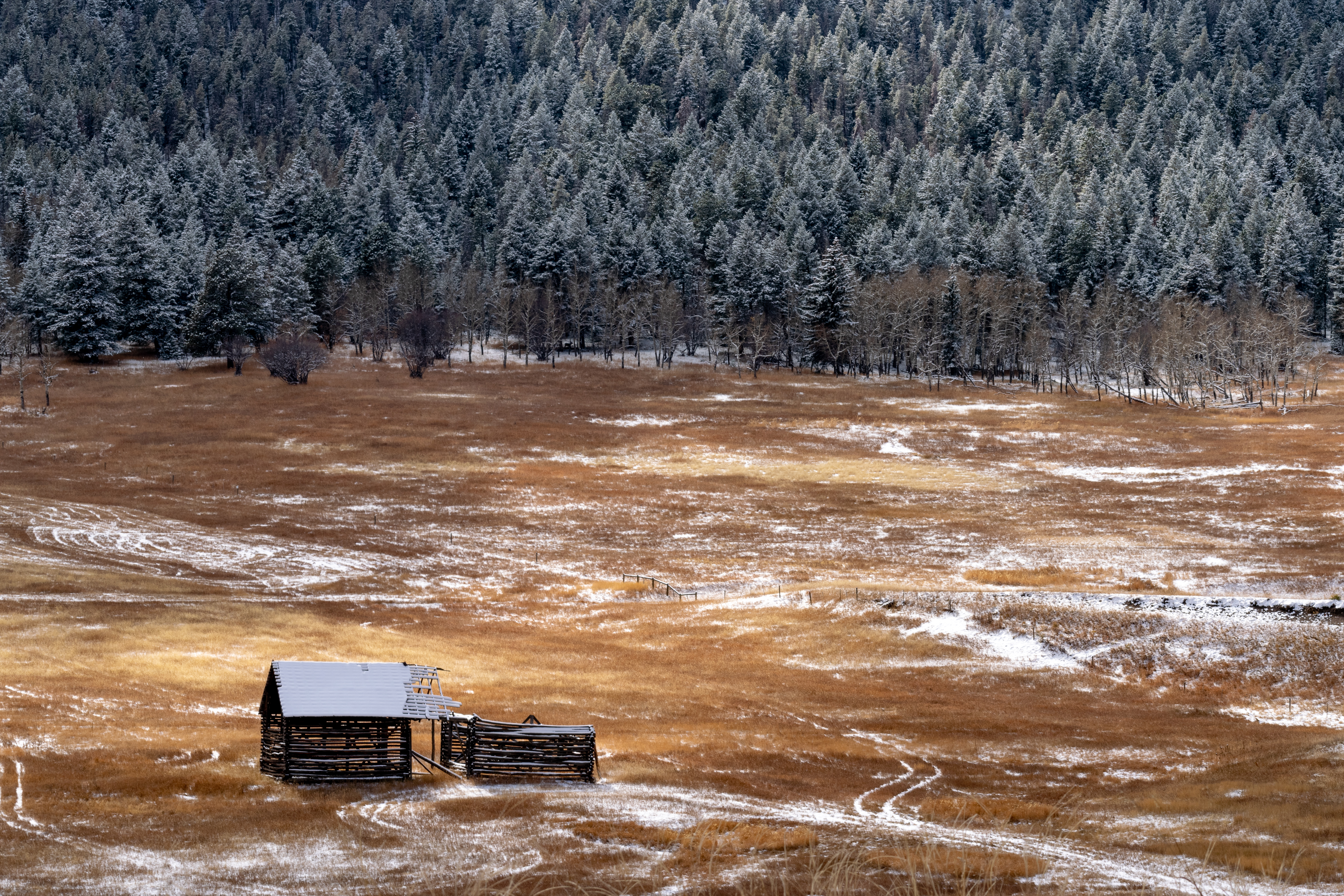
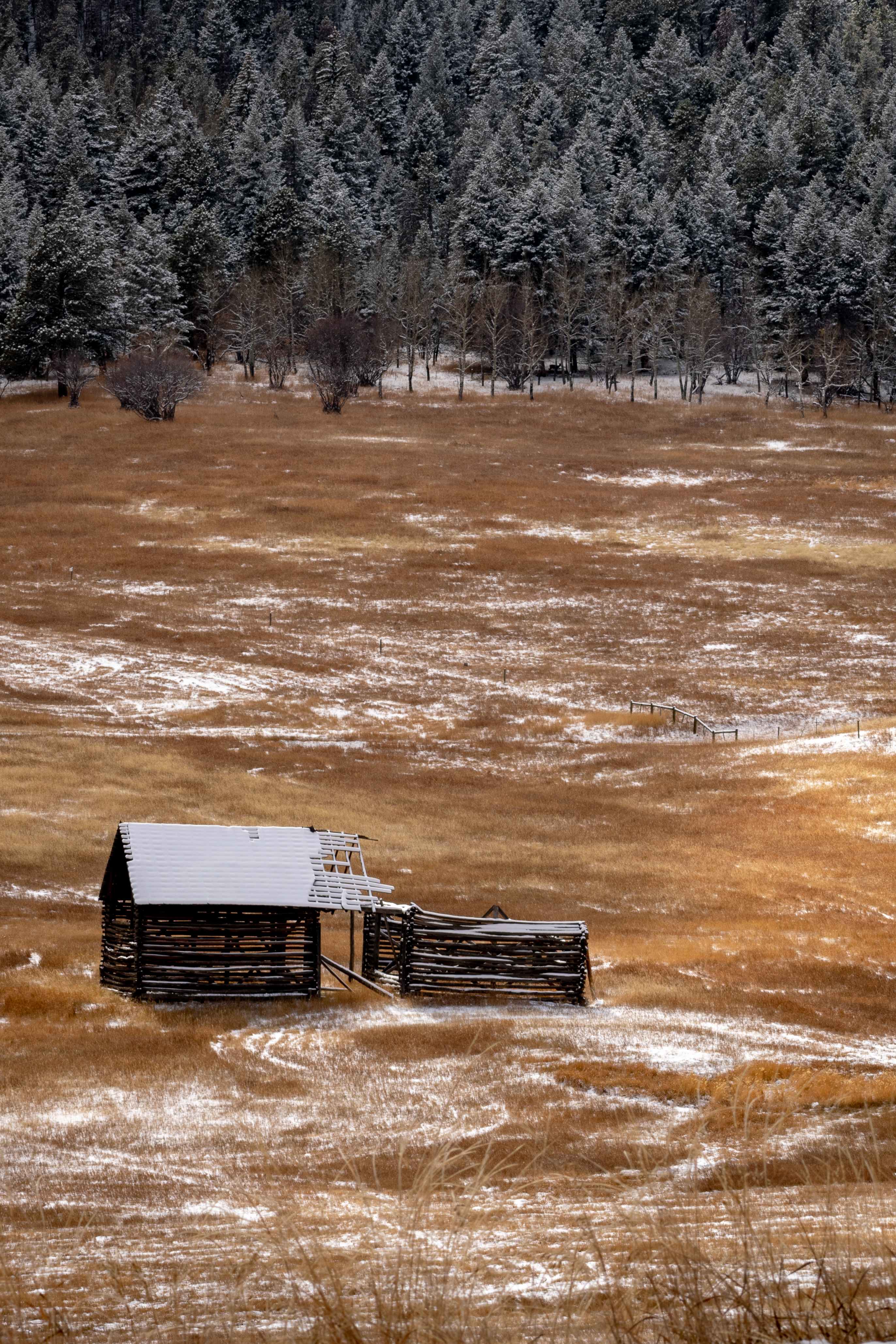
Nikon D5300, Nikkor 70-300 @ 80mm, Iso 100, f13 @ 1/125.
-
November 1, 2018 at 1:52 am #372629
I love the scene & color combo in this image Bruce. Nothing I can add from an ST viewpoint though…
-
November 1, 2018 at 11:05 am #372716
Thanks Tobie!
-
-
November 1, 2018 at 10:50 am #372713
- Bruce, I find the most interesting thing about this composition is the small fence somewhat in the center of the picture. I almost missed it. If there is another closer crop that would make that feature more prominent, I would like to see it. Nice light, nice color and careful composition!
-
November 1, 2018 at 11:04 am #372714
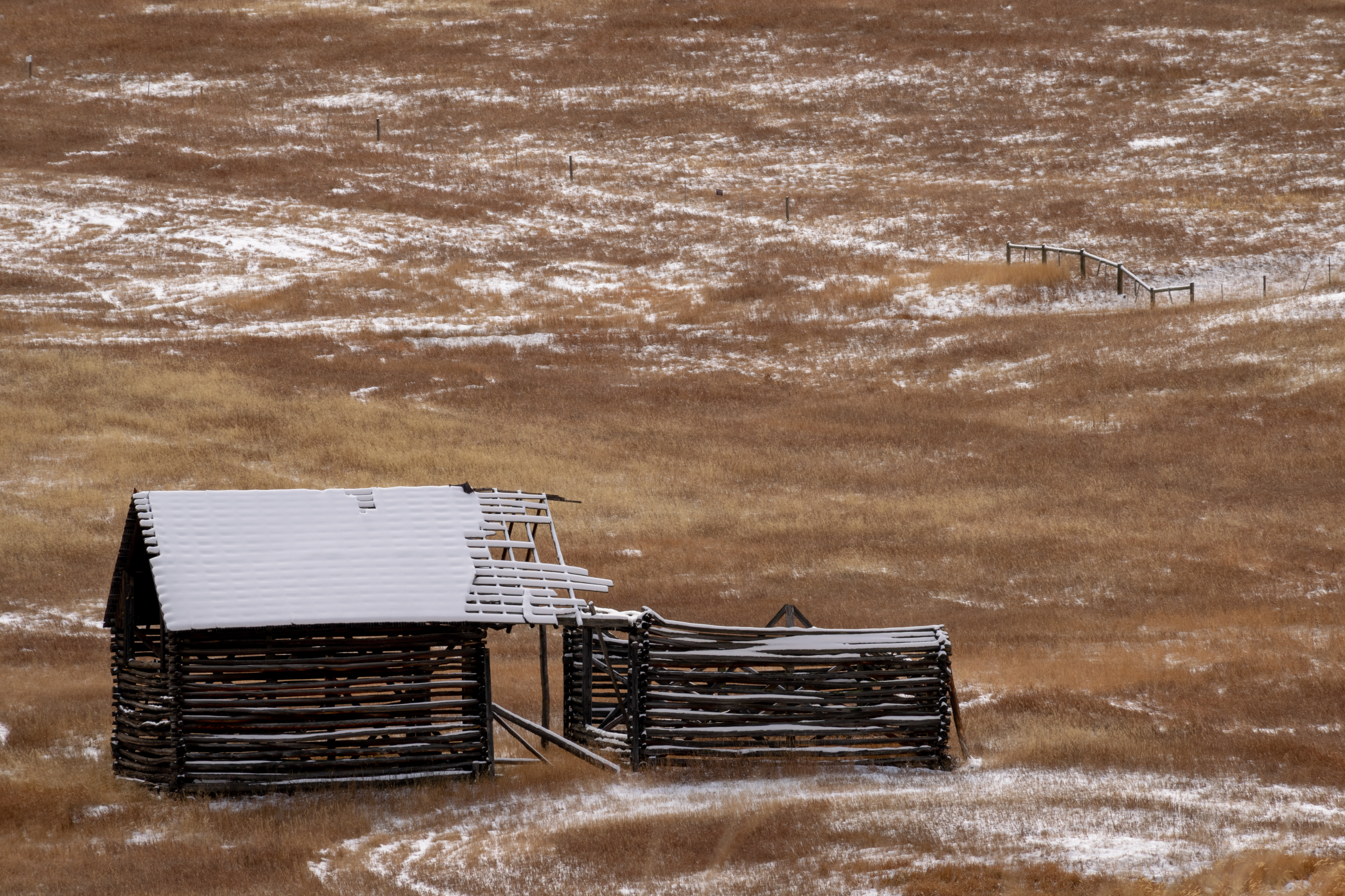 Thanks! Here is one I took at 195mm, f13 1/80sec
-
November 1, 2018 at 1:42 pm #372728
 Dahlia AmbroseKeymaster
- https://www.instagram.com/livingsta/
- https://www.flickr.com/photos/livingsta/
- Allows Edits: Yes
Allows Edits? YesHi Bruce, I like the image too. It has a dreamy feel to it.
My suggestion would be to have a bit more space at the bottom. Not sure what you think about it 🙂
-
November 1, 2018 at 1:46 pm #372730
I do like that section of fence!
-
November 1, 2018 at 2:53 pm #372737
Thanks Dahlia!
I agree. I was on a hill about 75 feet above the barn, which reduced the amount of foreground I could have. It was a sad choice between more trees or more foreground. There is a fence between where I was and the barn, which kept me from getting any closer. There is a trail into that area, which I will use after the next snow. It’s a few miles long and I didn’t have time to hike it yesterday. I’ll post a new shot when I can get closer.
-
November 1, 2018 at 11:53 pm #372785Dahlia AmbroseKeymaster
- https://www.instagram.com/livingsta/
- https://www.flickr.com/photos/livingsta/
- Allows Edits: Yes
Allows Edits? YesI understand why you framed it this way Bruce. Thank you. Look forward to more images 🙂
-
-
November 1, 2018 at 11:15 pm #372781
 Graham HartParticipant
- https://flickr.com/photos/139028632@N03/
- Allows Edits: Yes
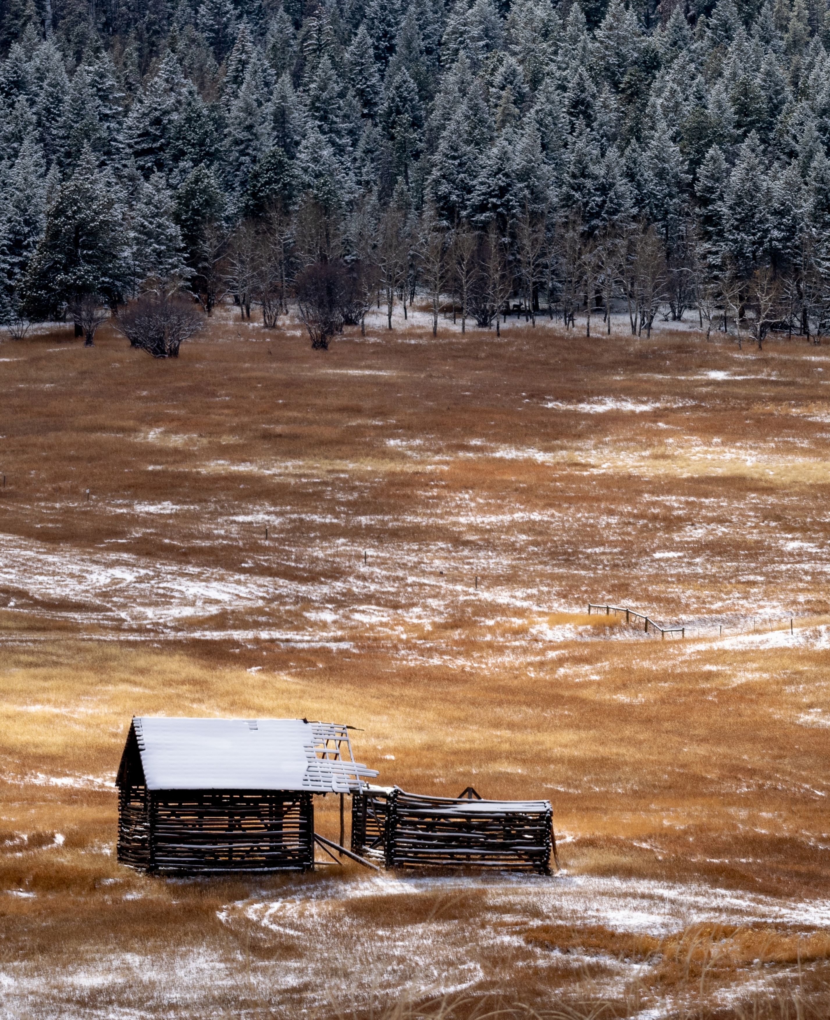
Allows Edits? YesHi Bruce, love the colour and textures in this pic. From a compo POV, the viewer is looking from an elevated position and to this end, I think that a portait aspect might be worth checking out to emphasise the depth in this pic. The RH third of the pic doesn’t have a lot of information in it. This would also place the tree line and the hut on the rule of thirds lines as well as bring more attention to the little section of fence. Dunno really, it does loose that wide open feel doing this I guess?
-
November 2, 2018 at 5:32 pm #372958
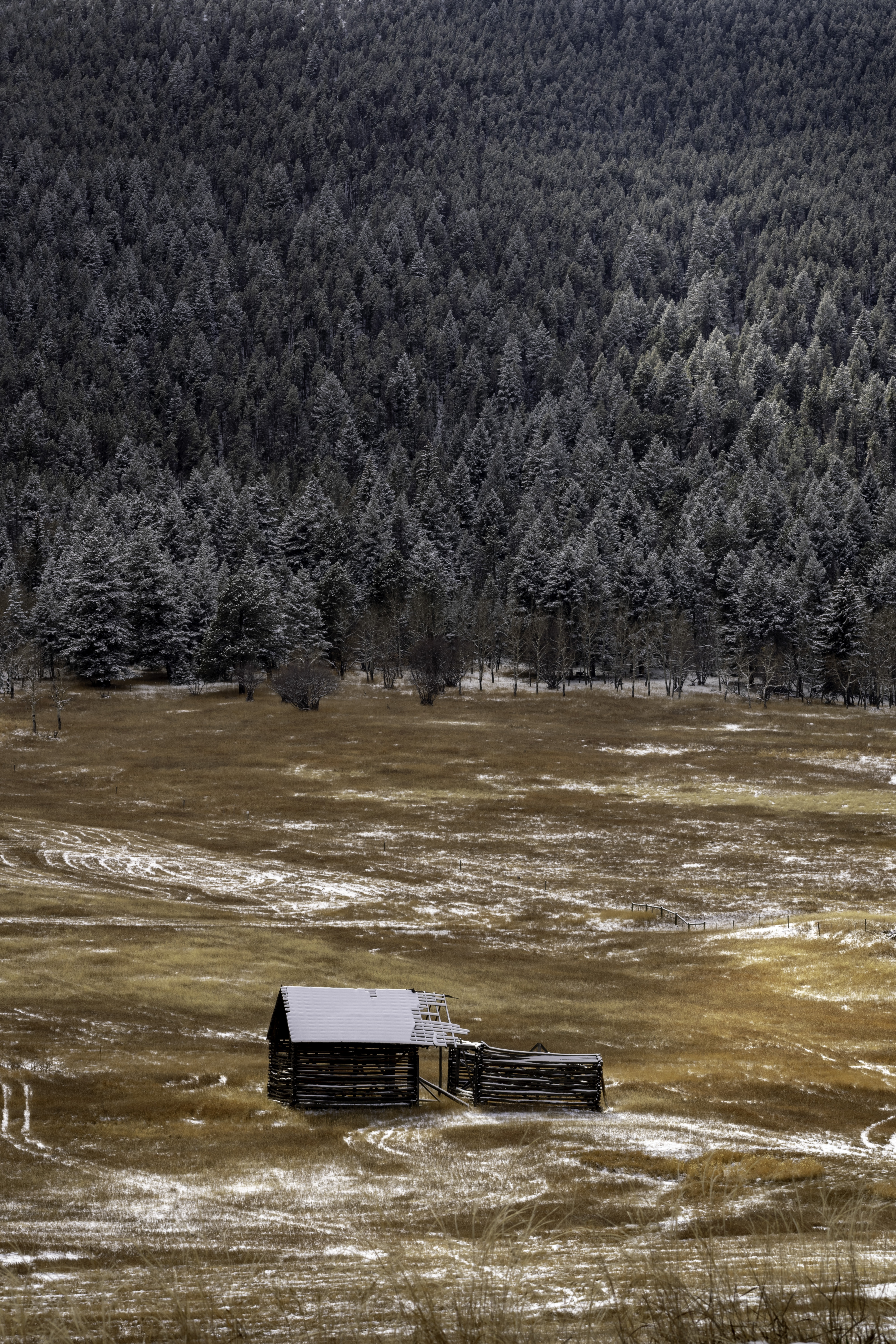
Funny you should say that, Graham! Here is another version, as shot in portrait without cropping. I had to make a choice, as I mentioned to Dahlia. I wanted the barn more to the left side of the frame, closer to the thirds rule, but tall grass to the right (which you can just see the beginnings of to the lower right) and a fence post prevented that composition.
I will be going back and hiking in, so I will be able to lower my perspective, which I agree will make all the difference, as I will be able to get a better foreground and more of the trees in the frame. I just hope it doesn’t snow enough to completely cover the beautiful yellow grass!
As always, thanks for your insight! I have learned much from you, and everyone!
-
November 2, 2018 at 5:41 pm #372960
Graham;
I played with the crop some on the portrait version. I think it works well…
-
November 3, 2018 at 5:40 am #372979Graham HartParticipant
- https://flickr.com/photos/139028632@N03/
- Allows Edits: Yes
Allows Edits? YesHmmm, I think I am now leaning back toward the original version too Bruce. I like the distance/depth aspect of the portrait crop but the landscape crop isolates the barn more in a larger space. It invokes a stronger feeling of isolation to the viewer, I think. This pic really leaves in an undecided quandry. Both aspects work well but I think the original wins by a nose 🙂
-
November 4, 2018 at 12:28 pm #373042
I learn towards the portrait image as well, because I like the way the light brings out the snow in the trees upper right of the frame. Plus I do like the isolation feeling of the photo. Choosing between two versions of an image is an interesting debate, both internal and external. For me, understanding what others feel helps better reflect on the emotion the photographer is trying to convey. The debate helps focus image selection and technique going forward to improve the expression of the emotion conveyed, if that makes sense…
Thanks for helping with that process!
-
-
-
November 12, 2018 at 9:09 am #374353
Graham, you have a good sense of composition.
-
November 2, 2018 at 6:58 am #372810
 JasenkaGParticipant
- https://instagram.com/the_queen_of_poppies
- Allows Edits: Yes
Allows Edits? YesHello Bruce, I like your version of the photo (original one) the most. I find the composition, colors and your way to edit this pretty much impeccable. Great job!
-
November 2, 2018 at 5:28 pm #372957
Thanks JasenkaG!
-
November 3, 2018 at 6:18 pm #373004
A very interesting thread, Bruce, am glad that you posted. I keep changing my mind about the best version. By a very small margin I presently prefer Graham’s crop ………… but tomorrow?
-
November 4, 2018 at 12:32 pm #373043
Thanks Mistyisle!
As I mentioned in my response to Graham; while the technical knowledge gained in a forum like this is super helpful, for me the real benefit is the philosophical discussion and learning how technique moves forward an idea one is trying to express. This forum is invaluable because we discuss things beyond technique!
All the best!
-
-
November 12, 2018 at 9:16 am #374355
I like your image very much, and the original composition is quite appealing. I have one problem with it, and that is the little S curve formed by the tire tracks to the right of the building, and to a lesser extent the strong vertical white line on the far left. Visually, the S curve is a very strong shape and it attracts a lot of attention. So much so (IMO) that the building becomes secondary. My guess is that some folks might consider it a focal point to draw attention toward the building. However, I think it holds too much visual weight. The vertical white line has less visual strength than the S curve- but it’s located right on edge of frame, which turns it into an eye snag. This is why of all the different versions posted here… I prefer Graham’s. It has the same intent, and feel, of your original version- but without the distractions. It becomes more graphic.
-
November 12, 2018 at 9:29 am #374359
I totally agree, Kent.
-
-
-
AuthorPosts


- You must be logged in to reply to this topic.
