
Photography Forums › Photography Forums › The Shark Tank Feedback Forum › Trees on a foggy morning – is it too busy?
- This topic has 19 replies, 10 voices, and was last updated 7y, 10mo ago by
 Tom M.
-
AuthorPosts
-
-
November 27, 2018 at 6:21 am #377016
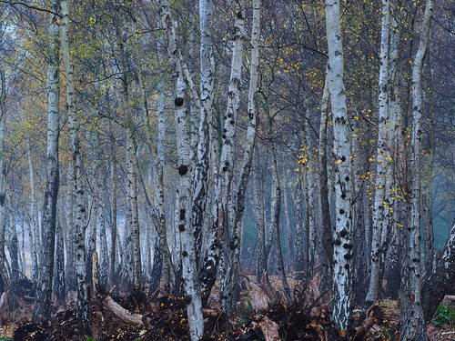
f6.3
1/15
iso 100
75mm (150mm equivalent)
I took this on a very foggy morning. I was taken by how straight the trees were and wanted to bring this out as well as the foggy eeriness of the scene. I don’t usually carry a tripod, but I did on this occasion. I used the de haze tool to make it less hazy and bumped the clarity up a bit
Maybe its too busy and missing a clear point of focus. Not sure if I should crop it from the bottom to only have the tree trunks and not the messy dead wood at the bottom or does it add to the eeriness of the shot. Also i used f6.3, not sure I should have gone wider, to make the trees in the background fade into the fog more?
Critique appreciated,
Mostahfiz
-
November 27, 2018 at 7:59 am #377020
 Rob Wood (Admin)Keymaster
- https://instagram.com/lightstalking
- https://www.flickr.com/photos/lightstalking
- Allows Edits: Yes
Allows Edits? YesOoh, nice – there is a recent Thomas Heaton youtube video on how he edits these types of shots. Worth a search 😉
-
November 27, 2018 at 8:47 am #377023
Thanks Rob, will defo check it out
-
November 27, 2018 at 11:11 am #377045
 Robert AppleModerator
- https://www.instagram.com/robert.apple.98/
- https://photography667a.myportfolio.com/
- Allows Edits: Yes
Allows Edits? YesInteresting Shot Mostahfiz
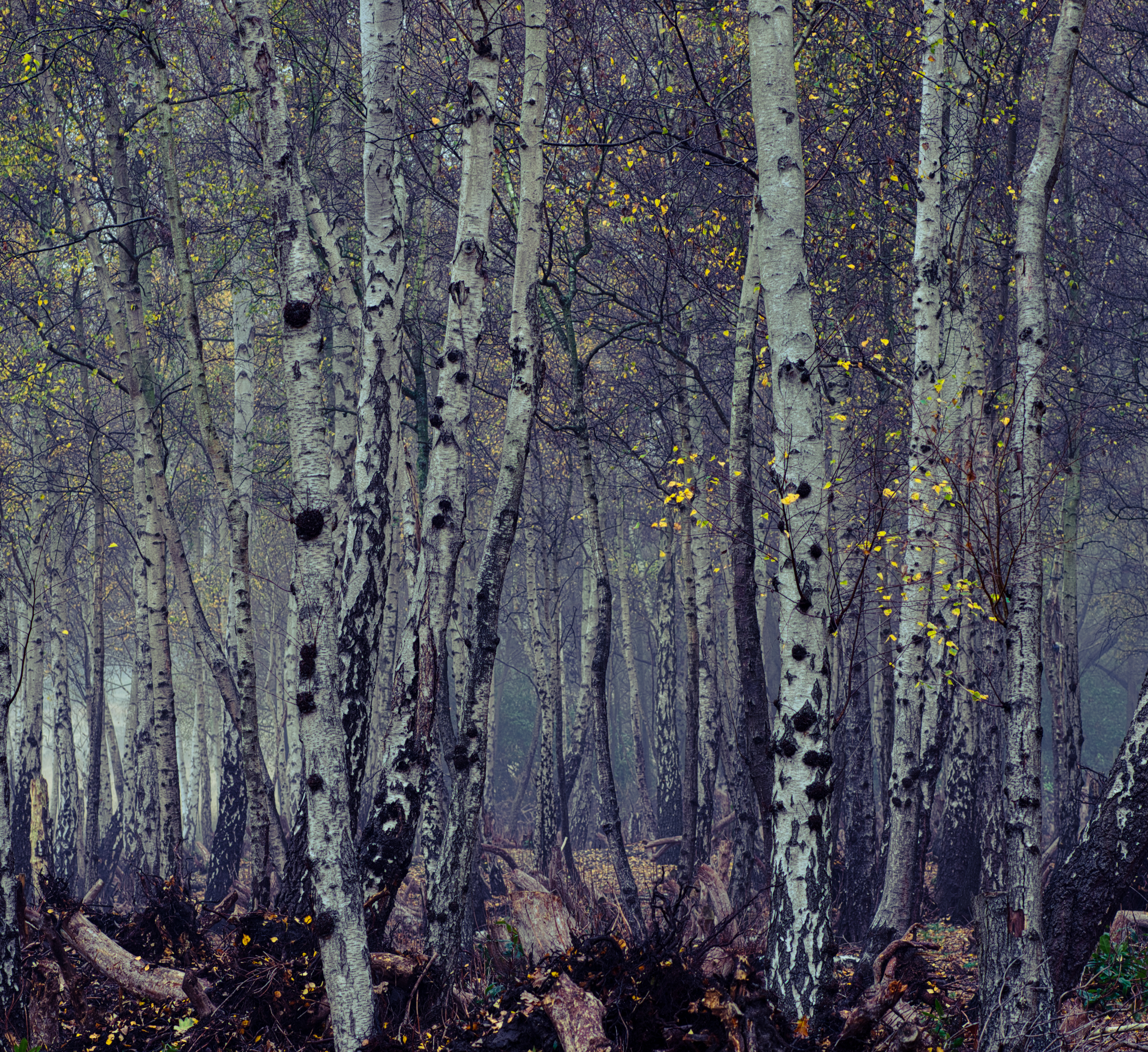
I would go with a square crop featuring the two forward trees, subdo the blue tint a bit and highlight the yellows to get almost a firefly effect, a bit more contrast would add a bit more depth and mystery to it, of course it is personal taste, I have a preset for lightroom called Foggy Forest I applied to it.
-
November 27, 2018 at 10:16 pm #377128Robert AppleModerator
- https://www.instagram.com/robert.apple.98/
- https://photography667a.myportfolio.com/
- Allows Edits: Yes
Allows Edits? YesI am for leaving the bottom in though I can see what the others are saying. The thing about this photo is it could make a variety of statements and represent multiple moods, and solicit many different options. I hope that if you do re edit that you post it. I would live to see YOUR final vision.
-
November 27, 2018 at 11:16 am #377047
I like the shot very much. In fact, I would consider cropping off the brownish area (the ground) from the bottom, and truly turn this into an abstract photograph. I looked at the file large, as you uploaded it. It looks pretty soft, which would be a disappointment. Perhaps the original is sharp, and it was just the upload? After cropping off the bottom- I would print it, frame it, and hang it just the way it is.
-
November 27, 2018 at 12:59 pm #377054
 Federico AlegriaParticipant
- https://www.instagram.com/federico.alegria/
- Allows Edits: Yes
Allows Edits? YesWell, it is busy, however it has a graphic design feeling thanks to the repetition, the patterns and the rhythm. I think you could enhance the fogginess by converting it to black and white and lifting up the blue tones (which are usually where the fog stands). But I think Rob’s suggestion could give you broader insights about how to reach the atmosphere that you want.
-
November 27, 2018 at 1:15 pm #377059
 Dahlia AmbroseKeymaster
- https://www.instagram.com/livingsta/
- https://www.flickr.com/photos/livingsta/
- Allows Edits: Yes
Allows Edits? YesLove this image a lot @mostahfiz . I would also agree with Kent about cropping a bit of the bottom 🙂
-
November 27, 2018 at 2:00 pm #377065
it’s not too busy, i like this one a lot. it does either need cropped, or show where the trees meet the ground. in the original the foreground trees are just floating. i like the neutral colors with the pops of bluish green and yellow.
-
November 27, 2018 at 7:46 pm #377106
I’m just new here (introduced myself a couple of weeks back, have had a hard time getting back to post!) but thought I’d add my thoughts. I agree it’s a great shot; I would also crop the bottom, however. Unless you try a black and white conversion, in which case I’m not sure if cropping would matter. It’s the brown at the bottom that pulls my eye away from the thick, beautiful trees.
-
November 27, 2018 at 8:00 pm #377107Rob Wood (Admin)Keymaster
- https://instagram.com/lightstalking
- https://www.flickr.com/photos/lightstalking
- Allows Edits: Yes
Allows Edits? YesAnd it’s nice to have you back @tracyf 😉
-
-
November 27, 2018 at 9:22 pm #377118
 Graham HartParticipant
- https://flickr.com/photos/139028632@N03/
- Allows Edits: Yes
Allows Edits? YesWell there always has to be one swimming against the tide and I guess it’s my turn. I actually like the layer of messy brown stuff along the bottom. The trees seem grounded in it (Duh!) and if cropped, I feel this pic would well and truly cross over into the realms of shapes and texures and art. Still a great pic but different from ‘the foggy eeriness of the scene’ you were trying to capture.
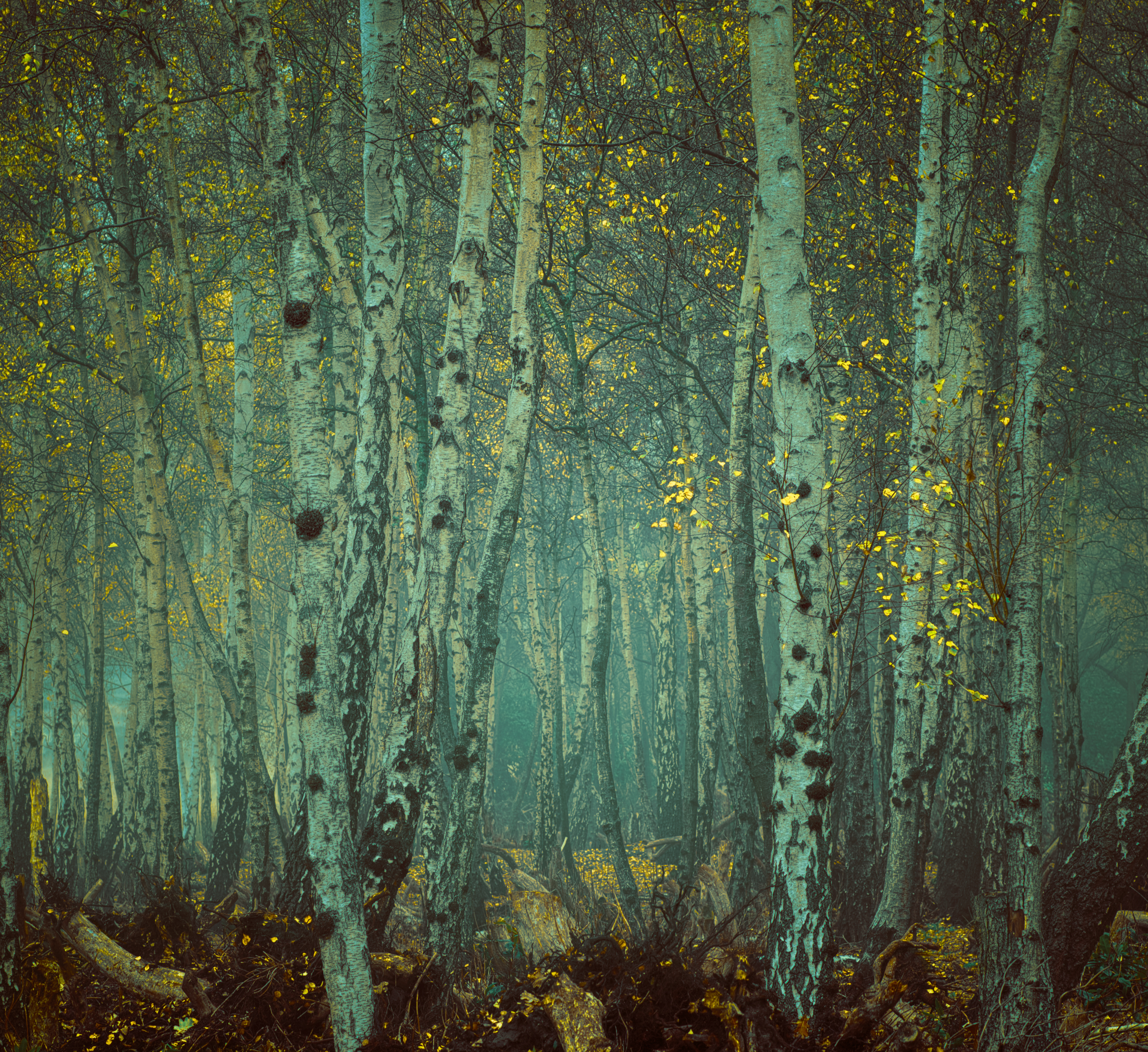
I like Robert’s edit best. I think his idea of featuring the two forward trees works well and I think the bright yellow flowers are the Thrillers in the Mist 🙂 . A light vignette adds to the mistyness too.
-
November 28, 2018 at 4:00 pm #377315
I really like the color edit you put into the photo Graham. I too like the foreground ground…
-
November 28, 2018 at 4:35 am #377203
Thank you all so much for the positive responses and suggestions. I am battling with flu at the moment, but I will definitely take on board your suggestions and post the reworked version here. I had also bracketed the shot, although it wasn’t required as the dynamic range was good enough and so I might play with a HDR version.
I really like the idea of a square crop as well as making it into an abstract, however when I showed it to my sister who is a Lord of the Rings fan, she immediately said ‘Lothlorien, please print it for me’, which kind of was my initial idea behind the shot. As Robert said, I think the image can represent multiple moods so will see.
-
December 6, 2018 at 7:24 am #378797
Just finished with the final edit,
I really struggled with this, and tried out many of the suggestions above, I think in the end, I leaned most toward Rob’s suggestion as it was the closest in line with my original vision. It was a tough call, and perhaps its the photo that has made rack my brains more than any others I have taken. But in the end I think I am happy with my final edit, off course this is the shark tank and so please feel free to critique:

Thank you for all your wonderful feedback
-
December 6, 2018 at 9:27 am #378814
I have to admit between this or your original version… I like the original better. (Just what you wanted to hear. Right?) 🙂
-
-
December 6, 2018 at 7:50 am #378798
just realised, had my monitor on full brightness, so it’s probably a bit darker than I would have liked…maybe.
-
December 6, 2018 at 8:43 pm #378893Graham HartParticipant
- https://flickr.com/photos/139028632@N03/
- Allows Edits: Yes
Allows Edits? YesYes looks a bit dark on my monitor Mostahfiz. Seems to have lost the misty effect slightly.
-
-
December 6, 2018 at 9:34 pm #378896Robert AppleModerator
- https://www.instagram.com/robert.apple.98/
- https://photography667a.myportfolio.com/
- Allows Edits: Yes
Allows Edits? YesLooks good on my Laptop. Nice edit.
-
December 7, 2018 at 2:12 am #378922
I like your final(though I like both), but the final now looks like a painting, I like that effect…
-
-
AuthorPosts


- You must be logged in to reply to this topic.
