Forum Replies Created
-
AuthorPosts
-
I think it was successful. I like it. Maybe a little more brightness to bring up the whites a little, and perhaps a slightly tighter crop so that the bird is a little bit larger. If this photo is sharp on a larger scale, I think it would make a pretty interesting abstract hanging on a wall.
Hi Shruti.
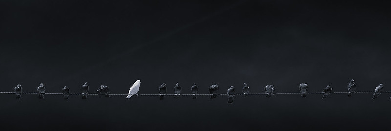
I use Silver FX Pro for my black and white conversions typically. I love it. It has several ways of doing it. One is by applying a color filter. In this case the sky was very blue and the birds are black, with the exception of the white one. I actually increased the saturation in lightroom prior to editing it in Sliver FX. Once in S FX I applied an orange filter, which darkened the sky to almost black while not doing much to the birds at all. I reduced the strength of the filter until it felt like the right balance. Silver FX also has a set of sliders which allows you to selectively control many characteristics of the original colors (while in black and white). I believe in Lightroom you can do the same, but I just love to use Silver FX.
Hope that helped and did not bore you too much!
Fred
Thank you Karamen! Amazing city. I had never been there before. So much to see. So many cool buildings to photograph. I will definitely go back one day only for that.
How about this one?
Fred
Very nice. This is one of those images that I would not mind spending some time getting the editing just right. Very nice.
Fred
Oohh, I love that last one! There is so much hidden color in those water reflection. Beautiful!
October 27, 2014 at 9:50 pm in reply to: Stockton Beach, NSW Australia, amazing dunes close to the Sydney doorstep #158553Wow. This is very cool. I love this treatment. It looks like creamy ice cream! Very nice.
Nice, intense colors. I like this a lot!
I think it works. Looks very cool. I had to look at it for a little while to figure out what was going on. I like it.
Fred
I agree with Yumarena. It is a little hot on the face, ball, and arm. I also do not like the cars in the parking area in the background, which then makes me look at the wires. I think you could have placed yourself so that the background was cleaner or more relevant. I think overall the concept is good and the player looks good, but that a little more care should go into he overall composition. Good job, though.
Fred
Agree with Nikon Nut. Your problem is composition. At least with this image. Not much roaming of the eyes. I find that my eyes get trapped circling around the water’s edge in the center of the image, and there is not anything particularly interesting there. I think that in this image, standing in a different position to have a stronger “S” curve to the river’s edge, a tighter crop at the bottom or maybe composing to a rule of thirds grid, would have helped.
Thank you both so much.
Alister, I actually cropped in that side a little on purpose because there is a large electrical pole with tons of wires, etc. coming out of it which looked ugly. I loved the reflections and that was one of the things that I wanted to capture. I loved all the layers and hoped they would come out in the photo.
Shammy. I did not necessarily have the high color theme in mind when taking this photo and was more focused on the layers. I did know it would be either slightly HDR’ish or black and white, which is what I tend to shoot (along with portraits). I was very pleased that the reflections were there and very happy as the colors started to pop in the processing. I’m very pleased with the digital version of this and can’t wait to see what it looks like printed. I’m tempted to print on a watercolor textured paper, or perhaps on aluminum.
Thank you for taking the time to comment!
Fred
Thank you so much, Albidrer!
I took the photo standing at the entrance to the distillery, which has a recessed glass entrance, so I am shooting through two pieces of glass. The first in the foreground and the second facing the street. The reflections on the right are on the first glass window (in the foreground). It is reflecting a brick pattern on the sidewalk. If you look at the sidewalk on the left, it is concrete, but at the bottom left corner you can see a sliver of the reddish brown color. That is the beginning of the brick pattern on the sidewalk. This is what is being reflected on the lower right. All these different planes of reflections are what attracted me to this photo.
Thank you so much for your comments!
Fred
Not sure I did this right. I don’t see my image above (?)

Not sure why the HTML link is not working…?
You’re right @gaganred . The brighter exposure does eliminate the sparkle of the reflections a little. The nose one was a little too hot. I agree with everyone who said this. The eyes are wet, so a strong catchlight reflection there looks natural and healthy, but the one on the nose feels like it needs to be toned down a bit.
Ok. Here is my shot. Not sure if it an improvement but here it is. I tried to keep that feeling of a divine light shining on his/her face. I felt the square crop worked, since in the original there is a lot of black on the sides of the frame that seem to add nothing.
The RAW file was very underexposed. You definitely needed more light.
Got it. Thanks @gaganred . Will try tonight.
Would love to give it a shot as well.
That seems off as well. If he is drawing her, why are they sitting side-by-side on the bench? They should be facing eachother, at least slightly. It seems like she photobombed the moment, as if his subject is sitting somewhere across from him, not beside him. So maybe the camera angle is also not ideal. It feels like two separate stories (to me).
-
AuthorPosts

