Cara Kelly

Forum Replies Created

Viewing 20 posts - 1 through 20 (of 20 total)
  • Author
    Posts
  • in reply to: Weekend Photography Challenge #167 Frozen #122714
    Cara Kelly
    Participant
      • Allows Edits:
      • Posts:23
      @ckinil

      No Achievements Yet!

      Here’s one from this weekend. It wasn’t as cold as it has been, over 20 degrees (F) when I took this, so I didn’t feel all that frozen. But the ponds at this park are all frozen solid still, so…

      Sunny red by Cara Kelly on Light Stalking

      in reply to: THROWDOWN: Autumn Leaves #112816
      Cara Kelly
      Participant
        • Allows Edits:
        • Posts:23
        @ckinil

        No Achievements Yet!

        I like this a lot.

        in reply to: THROWDOWN: Bokeh #112801
        Cara Kelly
        Participant
          • Allows Edits:
          • Posts:23
          @ckinil

          No Achievements Yet!

          These are great examples. I really like the rabbit.

          in reply to: THROWDOWN: Autumn Leaves #112768
          Cara Kelly
          Participant
            • Allows Edits:
            • Posts:23
            @ckinil

            No Achievements Yet!

            Thanks, Jeff.

            in reply to: THROWDOWN: Autumn Leaves #112732
            Cara Kelly
            Participant
              • Allows Edits:
              • Posts:23
              @ckinil

              No Achievements Yet!

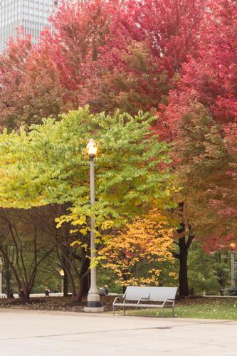
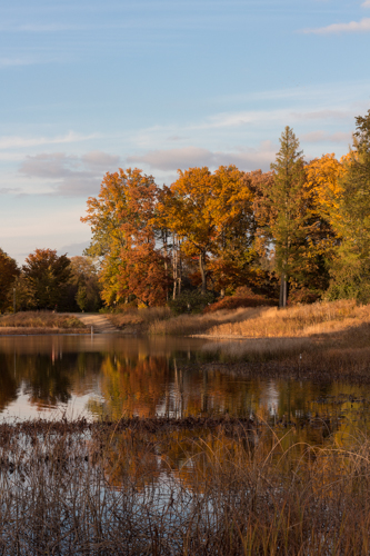
              I managed to get out last weekend in the Chicago area and get some shots of the fall leaves. A storm came later in the week and blew most of them off the trees.

              Morton Arboretum Fall Colors 1 by Cara Kelly on Light Stalking

              Morton Arboretum Fall Colors 2 by Cara Kelly on Light Stalking

              Millenium Park in Fall by Cara Kelly on Light Stalking

              in reply to: fountain coins #107185
              Cara Kelly
              Participant
                • Allows Edits:
                • Posts:23
                @ckinil

                No Achievements Yet!

                This almost looks like a fabric, one that is not laying flat. A shiny, silk charmeuse.

                An option might be to consider lightening the dark area only at the bottom, so that the picture gradually goes from darker to lighter. (or if you rotate it, from lighter to darker.) Just an option, not sure that would work since the lightest parts are in the middle.

                in reply to: THROWDOWN: Bokeh #107127
                Cara Kelly
                Participant
                  • Allows Edits:
                  • Posts:23
                  @ckinil

                  No Achievements Yet!

                  Wow

                  in reply to: Four Apostles #106886
                  Cara Kelly
                  Participant
                    • Allows Edits:
                    • Posts:23
                    @ckinil

                    No Achievements Yet!

                    FWIW, I really like the colors in this one. A little less moody than the other one, but I like the red/magenta tones.

                    in reply to: Please, share me some tips and lessons #106816
                    Cara Kelly
                    Participant
                      • Allows Edits:
                      • Posts:23
                      @ckinil

                      No Achievements Yet!

                      Since the corn field is nearby, you could try some shots that are not detail or close-up shots. Again, early in the morning or late in the afternoon, you could try a shot that shows the expanse of the corn field. I’m not sure what surrounds your field, but there may be an interesting landscape shot there. I’m just suggesting this as something to think about and to see if you can capture something there if you want to try something different from the detail shots.

                      in reply to: 6/12 Apostles #106582
                      Cara Kelly
                      Participant
                        • Allows Edits:
                        • Posts:23
                        @ckinil

                        No Achievements Yet!

                        What’s bothering me about the top apostle is that he doesn’t look like the others. He’s uniform in shape, texture and color, and the others are not. He’s also at a different angle than the rest.

                        I’m also finding that I wish I could see all of the bottom apostle, but maybe I’m OCD with symmetry.

                        I really like the colors, and the textures are cool too.

                        in reply to: Spider #106040
                        Cara Kelly
                        Participant
                          • Allows Edits:
                          • Posts:23
                          @ckinil

                          No Achievements Yet!

                          That thing looks huge!

                          I like that more of the web is visible in the first shot. (I know what not to walk into.)

                          in reply to: THROWDOWN: Bokeh #105712
                          Cara Kelly
                          Participant
                            • Allows Edits:
                            • Posts:23
                            @ckinil

                            No Achievements Yet!

                            Here’s some from early in the summer.

                            in reply to: O-Hum #105579
                            Cara Kelly
                            Participant
                              • Allows Edits:
                              • Posts:23
                              @ckinil

                              No Achievements Yet!

                              Well, shoot. I’m so glad I asked, because I wouldn’t have guessed even 10% of what you did. Actually, I might not even know what you’re talking about in even 10% of your processing description.

                              in reply to: O-Hum #105559
                              Cara Kelly
                              Participant
                                • Allows Edits:
                                • Posts:23
                                @ckinil

                                No Achievements Yet!

                                Okay, first, I’m not one to have lots of great recommendations since I’m very much still a beginner. But again, since it is the Shark Tank, I will pose one question. I really like this, but I find myself wanting to see more of the marquis (or whatever you call the rectangular structure that hangs over the sidewalk). I can see a little bit of light coming from the marquis and I want to see more. Did you get any shots with more of the marquis? That said, I’m not sure that including more of that would make this a better image. And if this marquis has the bright white background with the black letters showing who is playing, then including all of that would almost definitely completely change this image, and not for the better.

                                Another question for my own edification. You mentioned that you were trying to emphasize the texture too. Can you explain that a little bit more? Do you mean the texture of the building? While my eye went to the marquis last, I see a bit of texture there too. I think knowing a little more specifics about what you were emphasizing will help me better see what you actually did to achieve that.

                                Thanks.

                                in reply to: sunny flower #104283
                                Cara Kelly
                                Participant
                                  • Allows Edits:
                                  • Posts:23
                                  @ckinil

                                  No Achievements Yet!

                                  Seeing as how this flower doesn’t have petals per se, I’m going to struggle coming up with the names of the actual parts of the flower.

                                  I think your focus is on the wrong part of the flower if you were drawn to the trumpet aspect of this flower. The flower “leaves”–the long stick things with the little balls on the end–appear to be the parts in focus, but I think you would want the center part of the flower, which I think is called the stigma, to be in focus.

                                  I also don’t like the leaves in the upper right, but I do think the bright yellow against the green bokey background is attractive.

                                  in reply to: Blurring the back ground #103963
                                  Cara Kelly
                                  Participant
                                    • Allows Edits:
                                    • Posts:23
                                    @ckinil

                                    No Achievements Yet!

                                    You definitely achieved the blurry background effect. I, personally, am not thrilled that the back of the flower is blurry too. I think that might be okay if the bee is your main subject, but the bee is positioned such that it feels like a happy accident to me and not the main subject. And they are notoriously uncooperative when you want them to sit still. You maybe could have attempted a different angle to highlight the bee a little more and then I might not have minded that part of the flower is out of focus too.

                                    in reply to: Waiting #102206
                                    Cara Kelly
                                    Participant
                                      • Allows Edits:
                                      • Posts:23
                                      @ckinil

                                      No Achievements Yet!

                                      Only two things that caught my eye:

                                      How did you get the liquid in the bottle to not be flat or straight? Was the bottle in your model’s hand right before you took this shot, and the liquid is in the process of settling?

                                      Right now, the bottle suggests movement to me, and that doesn’t quite fit with your theme of waiting. If the model has been there a while waiting, then the liquid in the bottle should be flat and still. I think right now with the bottle, I get more of a sense of sadness than of waiting.

                                      I’m also not a big fan of what the mirror is reflecting.

                                      in reply to: Composition, other feedback? #99478
                                      Cara Kelly
                                      Participant
                                        • Allows Edits:
                                        • Posts:23
                                        @ckinil

                                        No Achievements Yet!

                                        Thank you everyone, I’ll see what I can do.

                                        in reply to: Composition #97649
                                        Cara Kelly
                                        Participant
                                          • Allows Edits:
                                          • Posts:23
                                          @ckinil

                                          No Achievements Yet!

                                          Agree with @wildmanaz.

                                          Just two thoughts on something you may have been able to try framing the shot when you took it.

                                          1) Could you have stepped to your left to get primarily dark forest behind the mushroom? Although I do like the framing elements of the mushroom between the two nearest trees.

                                          2) Could you have gotten some of the pine needles/foliage in from the tops of the trees, by just stepping back a few feet? The mushroom, of course, would be smaller, but the contrast between its smaller size the height of the trees could be interesting.

                                          in reply to: Petunias #97604
                                          Cara Kelly
                                          Participant
                                            • Allows Edits:
                                            • Posts:23
                                            @ckinil

                                            No Achievements Yet!

                                            You know, I don’t see crop #2 in your first photo; that is, I don’t know how you would have cropped to get here. It looks to me that you reshot the image. None of which really matters, just an observation from someone who’s still learning herself.

                                            However, in crop #2, I would have cropped to cut out the pink corner in the upper left. Then you have blue flowers circling the pink ones. If you wanted pink flowers on the left side of the picture, I might have framed to get some blue on the right side too.

                                            And lastly, if you could have reached in and pulled out the spent blossoms, I think that would help.

                                          Viewing 20 posts - 1 through 20 (of 20 total)