Forum Replies Created
-
AuthorPosts
-
October 13, 2019 at 7:17 am in reply to: Weekend Photography Challenge #456 Get Closer/Fill the Frame #421696

Hi Rosgats. Nice attempt, but for me there is too much in this photograph competing for my attention. I would like to see the biscuit tin moved out of sight, and a shallower depth of field to isolate the bouquet more from the background of sideboards and portraits. Or perhaps you could try filling more of the frame with the bouquet so that we don’t see the background clutter
December 29, 2013 at 4:21 am in reply to: Weekend Photography Challenge #164 Working in the New Year #116624Thank you speedx. I now have a goal to create magazine quality images of my own hometown.
December 28, 2013 at 1:27 am in reply to: Weekend Photography Challenge #164 Working in the New Year #116557Thanks @speedx. You are absolutely right and your comment has changed my mindset and given me a whole new outlook and goal. I need to improve my technique to take magazine quality images of what seems ordinary to me for those who don’t know areas like this to see something different. Thank you.
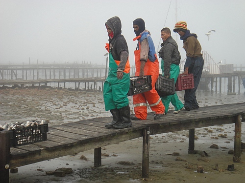 Fishermen.jpg by Desi on Light StalkingDecember 25, 2013 at 9:39 pm in reply to: Weekend Photography Challenge #164 Working in the New Year #116452
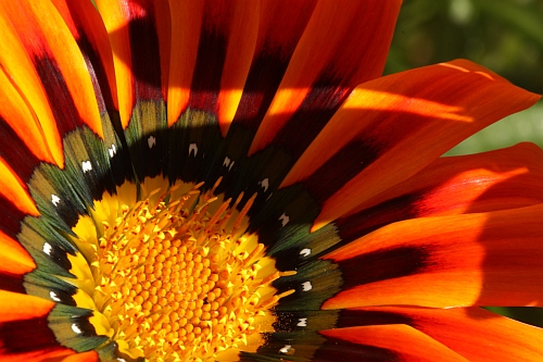 Gazania.jpg by Desi on Light Stalking
As I find the scenery in general in the area in which we now live to be fairly uninspiring, I have realised I need to focus on the details instead of bemoaning the lack of beautiful landscapes. One of the things I need to learn is how to take consistently better and more interesting photographs of flowers.

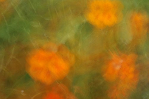
The West Coast wild daisies only open in the sunshine. Here the orange coloured daisy is just starting to unfurl itself in the sunshine after the rain, whilst the other flowers are still tightly closed and can barely be recognised as flowers. (they just look like little white or pale yellow dots in the grass). In another hour’s time this field will be ablaze with colour.

Wild flowers growing on vacant land down near the river. This was taken a couple of weeks ago. By now, when the sun is out, there are fields alongside the roads that look like they are carpeted in snow. Most of the year this is quite barren, almost desolate looking – but for a couple of months at this time of year the whole West Coast springs to life with the most wonderful flower display
Wow, I’m blown away by the comments and suggestions. Thank you so much to all who responded. Some great information to help me improve on this, and some fantastic ideas and tips.
Apart from the black area that should be the face of the statue, I like this. It looks like the lighting is behind and above you. Is there any way to visit this spot when the light is from a different direction, or when the light is softer/more diffused, to try and get some detail in the face and chest which is currently just a deep blackness?
What a lovely photo to look at. I agree about the logo looking like a tattoo. I would also ask the mother to move her head slightly in the pose, so that her nose isn’t squashed into a crooked shape, and also to avoid the deep shadow between her nose and the baby’s head. (Though perhaps that shadow could be lightened with post processing?)
I think it is compositionally and technically really good, but it certainly has me wondering what it is all about. Why are his hands the most important part of the picture? What is the significance of those hands? I like the atmosphere created by the stong lighting and deep shadows, except the blown highlights on his left hand are a bit disturbing, like a beacon blinking at me and drawing attention away to his hand all the time.
I agree with @photogmom about the shadows – that was the first thing I noticed even in the thumbnail. Though it is a nice clear portrait, I feel the placement of the subject in the frame doesn’t work for me. There is an extreme amount of white space on the left and nothing appears to have been composed to be on a thirds line – his gorgeous eyes have been placed dead centre horizontally, and there is nothing on a vertical thirds line as he is so far to the right. So perhaps a different crop might be more pleasing to the eye?
Derelict Jetty

Old fishing boat

Thank you, @karamen. I am still trying to gain confidence …

My first attempt with the new lens I got for my birthday – pelargonium buds

IMG_3827.JPG by Desi on Light Stalking
IMG_3827.JPG by Desi on Light Stalking -
AuthorPosts


