Forum Replies Created
-
AuthorPosts
-
October 8, 2021 at 4:14 pm in reply to: Weekly Photography Challenge #559 Urban Street Photography ! #485527
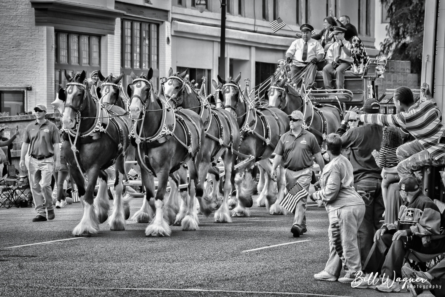
Birmingham Veterans Day Parade ~ Budweiser Clydsdales
 October 8, 2021 at 3:58 pm in reply to: Weekly Photography Challenge #559 Urban Street Photography ! #485525
Veterans Day Parade
Yes, lburgess, I wrestled with the sky for a while. I have several other textured versions of this photo which are more ‘sky friendly’. The dark vignette had more impact and expression to me than a lighter vignette. A subjective choice in the end. Plus the image seems more balanced overall when viewed at a larger size. Light Stalking limits the viewing size more than I would wish. Thanks for your feedback!
uneasy, unsure on the left … somewhere between bored and restless on the right
Thanks for feedback.
In some ways. I am still trying to perfect my technique. I use PSP X6 for layers and textures, not Photoshop. I can’t quite get the “look” I am going for … the “look” varies from picture to picture, of course. I admire a lot of work I see online, and I want to be able to achieve that plus create my own unique style.
Thanks, all!
The texture is very nice for this shot. Would like to see a larger image to be able to know more. Would like to see the candle with a bit more clarity. Nice overall.
Thanks for you comments. Good suggestions.
Thanks, all!
I would like to see the EXIF data. The focus is on the eyes and beak, which is as it should be. The colors are a bit drab. Perhaps a bit more light on the white feathers of the neck and some added contrast, being careful not to overdo it.
Thanks, all for your input!
I would look at a bit more foreground and a bit less headroom. Shadows make the shot, so consider less overall crop, if applicable. Nice work.
Thanks for taking the time to provide useful thoughts!
“No man has the right to dictate what other men should perceive, create or produce, but all should be encouraged to reveal themselves, their perceptions and emotions, and to build confidence in the creative spirit.” – Ansel Adams
“Learn the rules like a pro, so you can break them like an artist.” – Pablo Picasso
Applewoodj, the photo has not been cropped. The crop angle has turned out to be the most discussed aspect here. I went back and checked it out and I think it could improve with a very slight clockwise tilt, about 1 degree. You’re from Canada, eh? 🙂
Choctawjake, I don’t recall the surroundings of this shot. I was fascinated by the unique water color, and that is what I wanted to emphasize in this shot. I grew up around the Gulf of Mexico. Very different water and beaches. This was my first time to see the Pacific Ocean.
Thanks for your input.
I get your point. Unfortunately I cannot change the crop angle without compromising the placement of the leaves and water in the frame. This photo is nearly exactly as shot. My camera is “long in the tooth” and is only 6.1 megapixel. Therefore, I try NOT to crop much, if at all. This helps me pay more attention to composition than I might otherwise. 🙂
probably just not paying attention … 🙂 I think the best aperture for landscape would usually be 11-16, but it depends on where you are focusing. I can’t recall if I gave it that much thought here … I think I just grabbed the shot and moved on.
thoughts?
I think the “off balance” you see is because of the way the beach lines and the mountain lines are converging at the horizon line. If I adjust the crop angle based on the “straight” ocean horizon alone, the picture is just as shown. As info I also used lens profile correction in LR.
-
AuthorPosts

