Forum Replies Created
-
AuthorPosts
-
Good instincts, the woman alone has much more impact.
I like this, it’s fun.
I think you could open up the shadows under the building in the background and I don’t really like the tone of the sky, maybe a bit brighter would be better (not all the way to white though).
You have a great eye Wilson!
Having looked at your Flickr feed I can tell you that I know a couple of pro photographers with 5D3s and 85/1.2s whose photos aren’t half as interesting as yours; a good illustration that it’s not expensive equipment that makes photos worth looking at, it’s the photographer.
To find something Shark-tanky to say – after taking in the subject my eye goes around the perimeter and I’d like to have a balance of the size of the corner triangles as it’s such a geometric composition but the rest of the processing seems pretty good (lower right corner slightly dark perhaps).
I agree with all of the above.
I’d crop it, flip it, rotate it.
And then I would be doing some dodging and burning to take it up a notch – personally I’d run strips of highlighting along the tree trunks and accentuate the line of the path by making it subtly lighter than the surroundings.
I quite like this.
I think the church has a nice form and the puddle ripples and pavement make it slightly surreal.
Personally I’d put it through a Photoshop layer stacking process to do some color adjustments and dodging / burning but that’s just part of my process with any image I like.
 <script async src=”//embedr.flickr.com/assets/client-code.js” charset=”utf-8″></script>
Canon 5 DII | 24-105 f/4 IS @ 85mm | f/4 | 1/80th | ISO 160
Left – Flashgun in Octabox w/ grid | Right – 2 Flashguns in Large Strip
This is where we ended up on the job.This is where we ended up on this job.
Original brief – something a bit edgy; but still a corporate image.
After more discussion and a chance to see the sample images we decided to go with a background that says ‘corporate offices in rural location’ and opened the lighting up considerably for a less dramatic look.
Thanks for the replies everybody!
Here’s a third version w/ more muted tones.
 <script async src=”//embedr.flickr.com/assets/client-code.js” charset=”utf-8″></script>
 <script async src=”//embedr.flickr.com/assets/client-code.js” charset=”utf-8″></script>
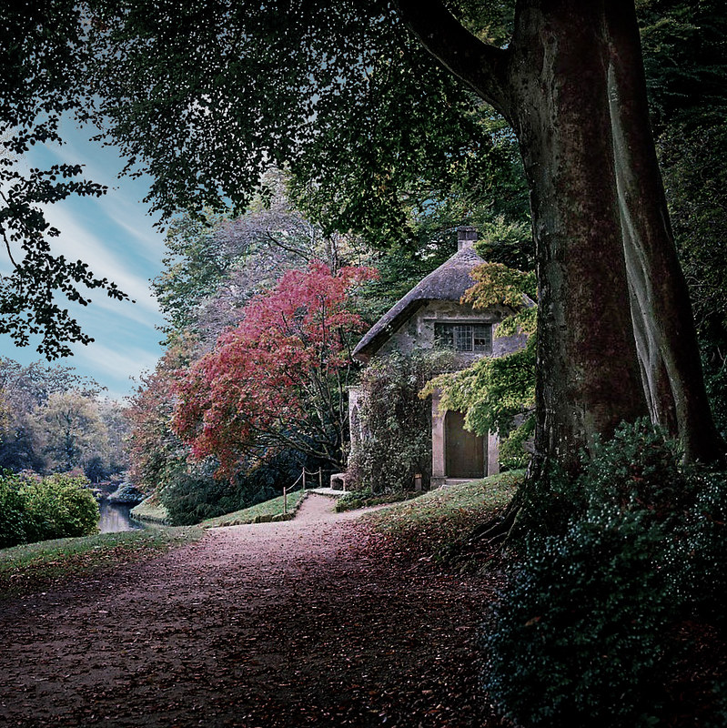
Reworked Stourhead Cottage photo
Hi guys,
Thanks for the feedback.
The brief is – the client likes the portraits on my website and has asked for something a bit arty / edgy for their team of youngish executives for their slick new website.
I would plan to light each person a little bit differently but generally going for ‘something a little different than the standard corporate portrait’.
For women I would add a good bit more fill to be sure.
Also a fair point re: how this would do in print but the brief was specifically for website use so I was being a bit bolder about riding the edge of dark grey / black.
Thanks for the feedback everybody!
I got swamped with work about a year ago and it kind of disrupted my habit of checking in here on a regular basis, good to see the crew is still going strong.
They are self portraits, going for the style of Rembrandt, which is probably a little dark and moody for your average corporate portrait.
Here’s the ‘safer’ version I just sent to my client.
Same set up but with a background light and a reflector underneath and in front.
 <script async src=”//embedr.flickr.com/assets/client-code.js” charset=”utf-8″></script>
Thanks Falx!
I cropped this image from a 360×180 photosphere.
Here’s a link to a Google Views tour that includes that shot.
https://www.google.com/maps/views/view/108943692469373049118/gphoto/6180802913168809298
It’s a problem without an easy solution perhaps but I think it would be better if the tallest tree in the foreground wasn’t connecting with the ridgeline behind.
I would be burning (darkening) the lower right corner as that area is pulling from the central composition.
I’d also clone out the dead snag in the foreground as my eye pulls there.
Could it benefit from a small amount of counter-clockwise rotation?
Perhaps try tweaking the tone curve to pull out more interest in the clouds.
It is nice though.
Yes, I agree that this is pretty good.
If it were me I’d have taken a step or two to the left to separate the line of the rocks from the encroaching tree branches.
Personally I’d also do some dodging and burning to add a bit more drama to the lighting, after using the highlights slider and tone curve in LR to reduce the patch on the left and give the mid-tone contrast a bit of a bump.
If time allowed I would consider this shot to be a ‘study’ for the shot that I’d hope to get as the light goes down and makes for more interesting colors but I understand that there are often other considerations; like getting back to the car before dark.
Hi Amber, I was only teasing 😉
If I had to choose one adjective to characterize your description of my photo ‘hallucinatory’ would be a strong contender though.
Thanks for your thoughts Claudia!
I can see the merits of both crops but in the second crop I wish the smaller branch off the large tree on the left wasn’t making contact with the side of the frame.
That’s awesome Amber, thanks!
In the immortal words of Musical Youth, ‘Pass the dutchie pan the left hand side’!
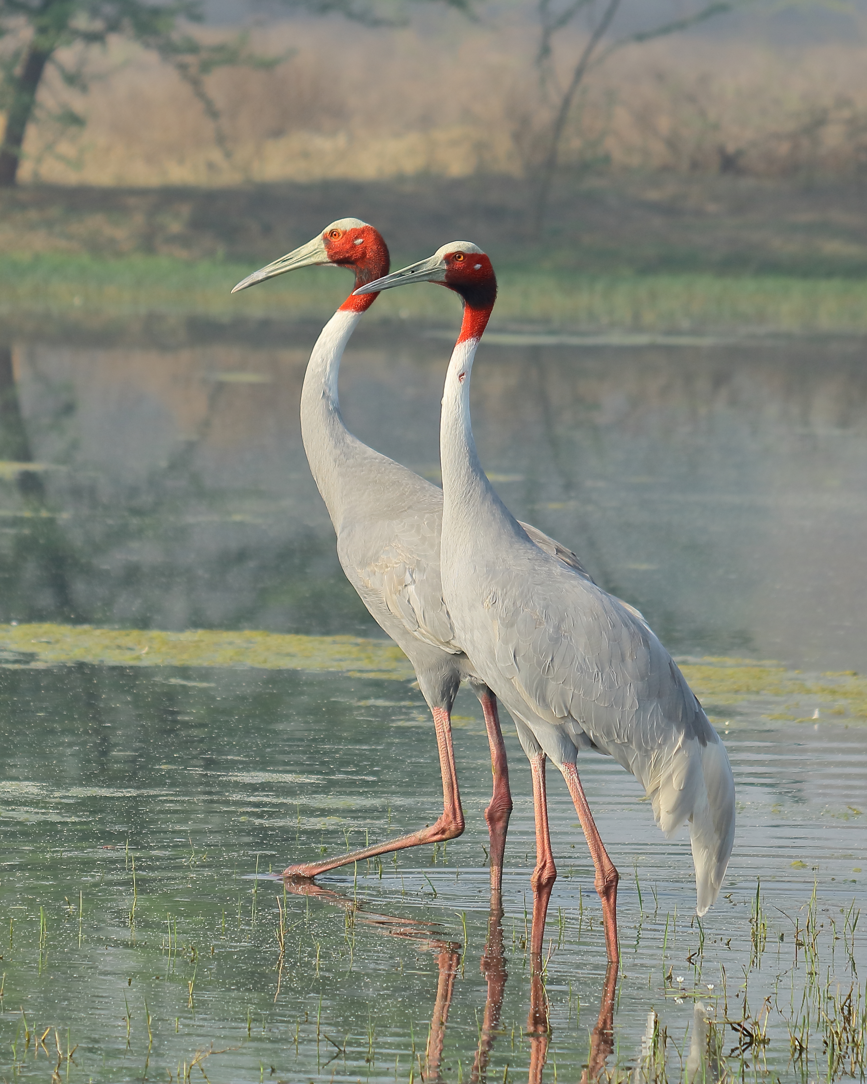
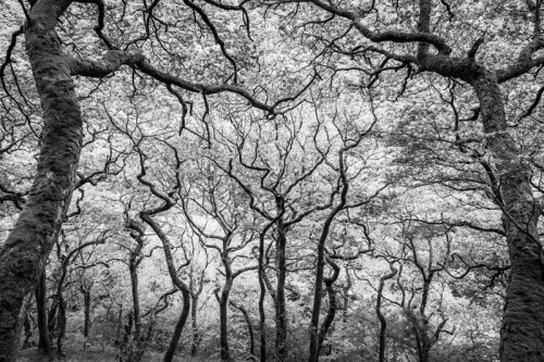 BWTrees2.jpg by Aaron Geis on Light Stalking
It turns out that I hadn’t adjusted the crop in post so I couldn’t add to the right side but I could trim the left a bit, carefully putting the intersection of the trunk to the side of the frame at the same horizontal plane as the trunk on the right.
That also trims off some of the space to the left of the left foreground tree if that addresses the issue Arthur is referring to.
Thanks Arthur.
Aww, Albirder, you’re too kind.
Funny I thought, ‘Did I just write scholar and a gentleman?’, surely it’s ‘gentleman and a scholar’.
I was probably flattering myself that Kent’s scholarly qualifications were inspiring his commentary, when, indeed, his gentlemanly attributes were undoubtedly to the fore.
I’ll revisit the crop and try to see if I can make an improvement along the lines you describe.
Kent, you’re a scholar and a gentleman!
Thanks.
I thought the trees kind of look like upside-down lightning.
I think portrait mode and closer to the ground would have more impact.
I’d also try either squared up or a further to the right strong diagonal, actually I’d probably try both.
This is good but the classic wedding photo treatment would be to go with a shallow depth of field.
You would still have the sense of the fountain as a setting but the emphasis would be on the bride.
-
AuthorPosts