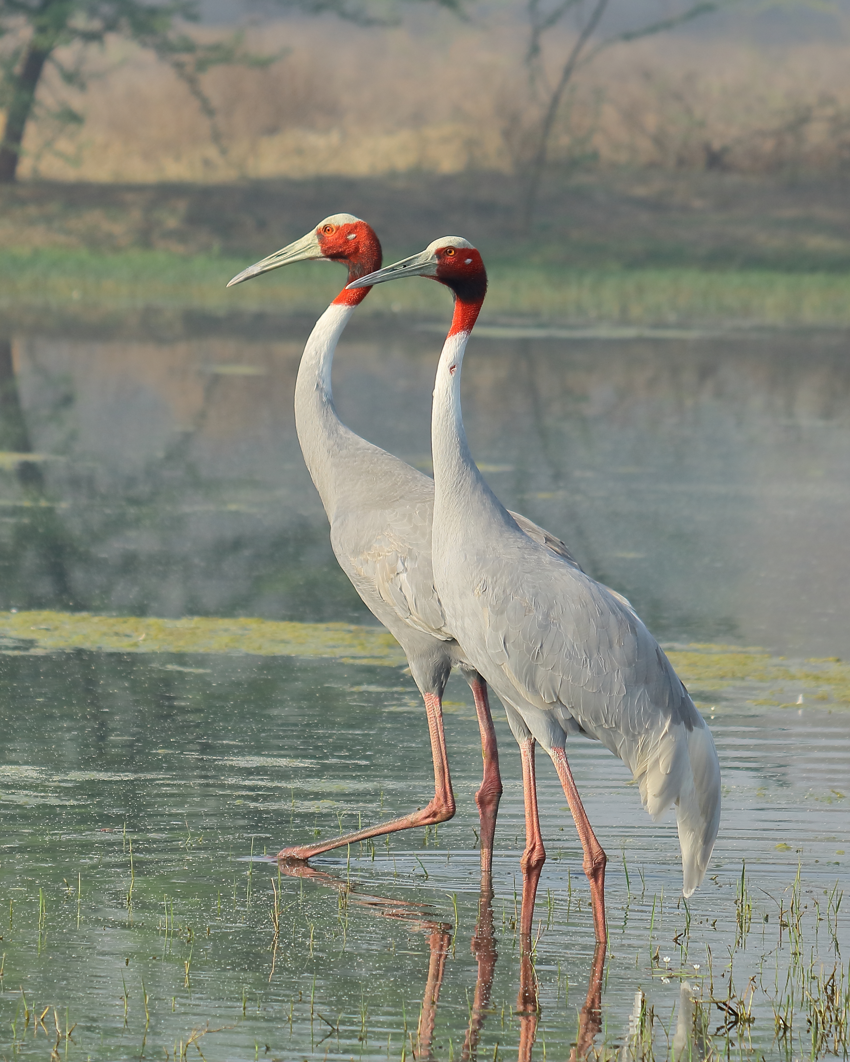
Interesting photo. I’m not sure exactly where you started or where you wanted to take it, but I think that you could make it a bit stronger. I found the little specks of bright white in the dark areas to be distracting. And I believe if you are going to effectively use negative space ( extreme dark or black areas), then light or white spots or items cause the eye to get distacted. I removed some of them for example. You have a lot of noise in the light areas in the background and tree limbs. I smoothed it a bit in the detail tab in Lightroom and it seemed to add a bit of a misty feel as well as reducing the noisee. I also think a bit more light in the shadows might help, only a couple of percent, so not much. Maybe just a pinch of a crop on the left to pull the light areas just a bit more out of center. This is purely my take and suggestions for you to think about. Maybe you did all of this and chose your presentation. It is after all, your image and interpretation. My opinion is just that and should not be considered as gospel, only as possible options.