Diogo Gonçalves

Forum Replies Created

Viewing 20 posts - 1 through 20 (of 128 total)
  • Author
    Posts
  • in reply to: I need help with my portraits #144776
    Diogo Gonçalves
    Participant
      • Allows Edits:
      • Posts:140
      @diogo405

      No Achievements Yet!

      Maybe her pose is not ok. Her face is not ok too. Seems she is angry. I would try another pose and expression. You cut her left arm near the joint. If she was wearing white I think it was better to detach her from background.

      in reply to: landscape #144397
      Diogo Gonçalves
      Participant
        • Allows Edits:
        • Posts:140
        @diogo405

        No Achievements Yet!

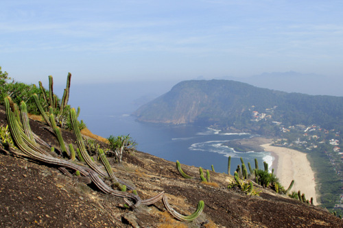
        Maybe if the sky had some blue parts the picture would become more interesting. The fog disturbed the sharp.

        in reply to: Beach at Mustang Island #143557
        Diogo Gonçalves
        Participant
          • Allows Edits:
          • Posts:140
          @diogo405

          No Achievements Yet!

          Nice B&W convertion. Nothing to improve. I liked the waves, the reflections, the people on the beach and the sky. Beautiful picture!

          in reply to: The Widow #143554
          Diogo Gonçalves
          Participant
            • Allows Edits:
            • Posts:140
            @diogo405

            No Achievements Yet!

            I liked the idea. To improve I would crop the green wall on the left, move the woman a little left to change her head position to avoid the towel and use a light to illuminate more her face.

            in reply to: BW portrait #143553
            Diogo Gonçalves
            Participant
              • Allows Edits:
              • Posts:140
              @diogo405

              No Achievements Yet!

              I liked the background and composition. I did not like the shadow of the nose in her mouth. The glass is causing a strange effect in her left eye. The light in her hair is good. I did not understand her pose. Is she feeling cold or hidding her bag? What do you would like to show?

              in reply to: Tokyo Night Lights #143437
              Diogo Gonçalves
              Participant
                • Allows Edits:
                • Posts:140
                @diogo405

                No Achievements Yet!

                For me it is ok, nothing to improve. Maybe show the entire car on left. I liked the lights, the cars, the HDR and composition. Good picture!

                in reply to: Sleeping socks #143152
                Diogo Gonçalves
                Participant
                  • Allows Edits:
                  • Posts:140
                  @diogo405

                  No Achievements Yet!

                  I liked the idea but I would include more part of the seat and show more background at top.

                  in reply to: Excited to get constructive criticism #143150
                  Diogo Gonçalves
                  Participant
                    • Allows Edits:
                    • Posts:140
                    @diogo405

                    No Achievements Yet!

                    I liked the DOF, the foreground and the fog. To improve I would remove the shadow of the foreground and I would include the whole tree in the right top.

                    in reply to: Accordion Player in Venice #142673
                    Diogo Gonçalves
                    Participant
                      • Allows Edits:
                      • Posts:140
                      @diogo405

                      No Achievements Yet!

                      I liked! The b&w convertion worked, the background is good (I liked the river and buildings) and the photo texture is perfect! I would try a new face expression for the musician, more concentrated maybe. Excellent image!

                      in reply to: Condolas Venice #142150
                      Diogo Gonçalves
                      Participant
                        • Allows Edits:
                        • Posts:140
                        @diogo405

                        No Achievements Yet!

                        I liked but I would add more space at the bottom to show the entire paddle. I also would like to see the sky. Maybe more space at top or shoot in portrait orientation.

                        in reply to: Landscapes at Nainital #142149
                        Diogo Gonçalves
                        Participant
                          • Allows Edits:
                          • Posts:140
                          @diogo405

                          No Achievements Yet!

                          There are some dark areas. Maybe if the clouds were more separate the picture would be more interesting. The blue sky would add more color and would contrast with the green.

                          in reply to: Sunrise at the Boneyard #142042
                          Diogo Gonçalves
                          Participant
                            • Allows Edits:
                            • Posts:140
                            @diogo405

                            No Achievements Yet!

                            I would walk back to shoot more wide. I would include the tree in a way that the branches would not stay in front of the cloud. Still a good photo.

                            in reply to: Costão #141903
                            Diogo Gonçalves
                            Participant
                              • Allows Edits:
                              • Posts:140
                              @diogo405

                              No Achievements Yet!

                              in reply to: Taj Mahal #141748
                              Diogo Gonçalves
                              Participant
                                • Allows Edits:
                                • Posts:140
                                @diogo405

                                No Achievements Yet!

                                I liked the light and composition. Nothing to add. Good job!

                                in reply to: your opinion is important, thanks #141448
                                Diogo Gonçalves
                                Participant
                                  • Allows Edits:
                                  • Posts:140
                                  @diogo405

                                  No Achievements Yet!

                                  It does not seem he is doing something with the sheeps. Maybe if he was more closer to the animals. I cannot see what he is bringing on his hand. The two people on the right are bit distracting. I would take the picture more closer with a wide angle. That is my two cents.

                                  in reply to: County Park #141255
                                  Diogo Gonçalves
                                  Participant
                                    • Allows Edits:
                                    • Posts:140
                                    @diogo405

                                    No Achievements Yet!

                                    I would add more space at the bottom to show the vegetation and I would crop a little on the left to decentralize the tree.

                                    in reply to: Venetian Laundry #141013
                                    Diogo Gonçalves
                                    Participant
                                      • Allows Edits:
                                      • Posts:140
                                      @diogo405

                                      No Achievements Yet!

                                      I liked the frame of the build, the sky and especially the man in the end of street. Nothing to add.

                                      in reply to: Concern #140972
                                      Diogo Gonçalves
                                      Participant
                                        • Allows Edits:
                                        • Posts:140
                                        @diogo405

                                        No Achievements Yet!

                                        I liked the light, the pose of the model and composition but her clothes did not connect with the room. I do not know what you want to show. Still great photo!

                                        in reply to: Skimboard #140608
                                        Diogo Gonçalves
                                        Participant
                                          • Allows Edits:
                                          • Posts:140
                                          @diogo405

                                          No Achievements Yet!

                                          @nanyar Maybe is not the higher shutter speed but the lower aperture. If you use a low aperture in a sunny day the shutter speed will increase to compensate (if you use a lower aperture with a lower shutter speed the sensor will receive much light).

                                          in reply to: Tossed pizza #140491
                                          Diogo Gonçalves
                                          Participant
                                            • Allows Edits:
                                            • Posts:140
                                            @diogo405

                                            No Achievements Yet!

                                            I liked the action freeze and environment. I would use a lower F stop to unfocus the background (window) and would crop the bottom right (menu and napkin) that are distracting. I would also crop the reflex at the bottom.

                                            I am talking about the first image. I did not like the colors of second image.

                                          Viewing 20 posts - 1 through 20 (of 128 total)