-
Keith Broad replied to the topic 18th hole Erinvale Golf Esate in the forum The Shark Tank Feedback Forum 10y ago
This shot has a lot going for it. You have caught the deep afternoon light and colours very well. Compositionally however, it is not clear what the subject is. My eyes are not drawn any point, nor are they led in any direction. If the figures are the subject you may want to get in closer and use the range behind to give a sense of place. If you…[Read more]
-
Keith Broad replied to the topic Love Lasts in the forum The Shark Tank Feedback Forum 10y ago
I think that all the renditions of the image are spoilt by the fence. Possibly, if it had not been there you could have, compositionally, achieved a strong image.
As to the subject of love, I think that there is not enough intimacy in this scene to convey that emotion. To me, the couple come across as a couple who are sight-seeing.
I do not…[Read more]
-
Keith Broad replied to the topic Climber – Lake Louise, Alberta, Canada in the forum The Shark Tank Feedback Forum 10y ago
The diagonal of the pale and dark rock creates a natural line for the eye to wander. The climber is like a full stop. It’s an image that works for me. The only thing missing is a sense of height to add to the drama. If the image was trying to convey that tension, then it is missing. I see that it must have been shot with a zoom, so I would have…[Read more]
-
Keith Broad replied to the topic THROWDOWN: Silhouettes in the forum Photography Throwdowns 10y ago
Whoops! I seem to have started a thread, when I meant to post here. Anyway this is an old favourite of mine.
-
Keith Broad started the topic Myles & Scarlet in the forum Photography Throwdowns 10y ago
Myles & ScarletThis is quite an old photo, but I still think of it as a favourite.
 Scarlet & Dad by Keith Broad on Light StalkingCheck It Out Reply to Topic
 -
keithinmelbourne uploaded a new picture: Scarlet & Dad 10y ago
 The light was low in the sky. Myles and Scarlet were playing together under the dappled light of a tree. This is an old shot (2007), but it's still one of my favourites.
 -
Keith Broad started the topic The Big Day Out in the forum 10y ago
The Big Day OutHere are a few shots from the moshpit. My wife said I was crazy: perhaps I am, but this type of photography is great fun . . . despite the injuries.
 Big Day Out 2014: Arcade Fire by Broad on Light Stalking
 Big Day Out 2014 by Broad on Light Stalking
 -
keithinmelbourne uploaded a new picture: Big Day Out 2014: T… 10y ago
 Confidence
 -
keithinmelbourne uploaded a new picture: Big Day Out 2014: T… 10y ago
 Intensity
 -
keithinmelbourne uploaded a new picture: Big Day Out 2014: T… 10y ago
 Solo
Solo -
keithinmelbourne uploaded a new picture: Big Day Out 2014 10y ago
 Regina Chassaugne from the moshpit
 -
keithinmelbourne uploaded a new picture: Big Day Out 2014: A… 10y ago
 Win Butler from the moshpit
 -
Keith Broad replied to the topic Happiness in color and BW, which one? in the forum The Shark Tank Feedback Forum 10y, 5mo ago
B&W and colour serve the photo well. The colour is very striking and the B&W emphasises the composition. Either way, great work.Check It Out
-
Keith Broad replied to the topic critique? in the forum The Shark Tank Feedback Forum 10y, 5mo ago
I agree with el-dub. I like the glaring sun and the reflection in the foreground. There is nothing wrong with the flare in this shot, because it adds to the story and the feeling. Well done, I say.Check It Out
-
Keith Broad replied to the topic Key West- newbie in the forum The Shark Tank Feedback Forum 10y, 5mo ago
Given that you’re a newbie I guess you have not ad much experience with post-processing. This is the kind of photograph I might spend a fair bit of time playing around with in Lightroom or Photoshop. As it is, it’s a nice photograph of a sunset. You were fortunate that there is enough layering of the clouds to create interest. You may want to…[Read more]
-
Keith Broad replied to the topic Please critic my shoot and edition in the forum The Shark Tank Feedback Forum 10y, 5mo ago
I’m not sure what you were trying to achieve here. The lighting and the pose look good to me, but I find the background a bit distracting, particularly the top right part. I also think the smoothing effect you have applied to the model makes her look very plasticky. I guess that you intended this effect, but for me it makes the photograph look…[Read more]
-
Keith Broad replied to the topic City lights in the forum The Shark Tank Feedback Forum 10y, 6mo ago
I guess I thought that the unbalanced position of the figure created a degree of unreality, almost surreality, as well as leading the eye through the frame. It’s always difficult to strike the right figure at the right time.Check It Out
-
Keith Broad replied to the topic City lights in the forum The Shark Tank Feedback Forum 10y, 6mo ago
Yeah, they do look over-processed, but they’re not. I added a little micro-contrast and a little colour vibrance, but other than that they have very little processing. It might have something to do with the X100s’ sensor, but I shot using RAW and Photoshop’s Camera RAW. I think that’s what struck me about the scene; it has an almost cartoonish…[Read more]
-
Keith Broad replied to the topic Portrait of a Dog in the forum The Shark Tank Feedback Forum 10y, 6mo ago
I think the second crop is better, but I agree with others inasmuch that the setting you have chosen is unflattering. A dog portrait needs to convey something of the dog’s character. You might try engaging with the animal, by playing or holding a tidbit. I find that animal portraits that look intensely at the viewer are more interesting. Whether…[Read more]
-
Keith Broad replied to the topic New Body, New Lens in the forum The Shark Tank Feedback Forum 10y, 6mo ago
I like the colours in the grasses, but I would work on the composition a little more. You have too much sky, which is overexposed. When the sky lacks interest, you might lower your gaze considerably and create more interest in the foreground. Check It Out
- Load More


Photo Of The Week
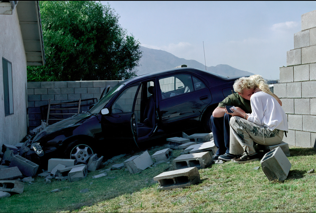
Photo Of The Week by Kenneth Wong – Read more about it here.
