Forum Replies Created
-
AuthorPosts
-
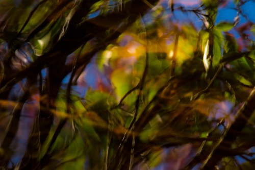
Nikon-Nut…thanks for willingness to keep checking out what I do because I really value your feedback, and again, sorry for my prickly response earlier. And I agree that the image is a little flat…needs more midtones.
First of all, I want to apologize to Nikon-nut for my prickly response to his feedback. That was uncalled for.
Secondly, I never made the claim that this image was abstract. I was just responding to Nikon-Nut’s comment that something must be in focus to an image to be credible. Or, as some of you seem to be saying, that there needs to be something to “latch onto” or something interesting. I brought up abstract art to make my point that for an image to be provocative or appealing there needs to be nothing in focus, or have an interesting object. When I take a photo I’m trying to capture whatever triggered an emotional response, not some perfect version of reality. I want to leave some room for the viewer to interpret their own meaning.
So, on one extreme is the photographer who is driven by post processing, a special place, a special object, and rules of composition to create what most people would agree as beauty; on the other extreme, are purists, who would never alter an image and want to impose their version of beauty on us. I think both extremes are wrong. I think this is an interesting discussion and hope it can be productive for all.I think you have to be very creative to stand out with these kind of shots. I think Davecarter’s feedback is right on.
Nikon-nut….I guess we just have to agree to disagree on this one. I can accept that my stuff doesn’t resonate with you, but it seems that nothing that is abstract would.
I think the green is a little too strong. It might work better as a b/w, but you would need to get more detail out of dark areas.
Nikon-Nut…I’m not saying that this is a great photograph, but I think you’re putting too much weight on focus. I’m sure there are many examples of great art, hanging in museums, where nothing is in focus. Focus definitely has it’s place as one tool the artist can use, but the bigger question is does the image resonate with the viewer.
This would be better in black/white. The color is not compelling enough and just distracts from what’s really interesting…which is something like why has she stopped sewing? What is she thinking about?
Definitely like black/white better. The van just distracts from the beautiful tones/textures. I would do something to bring out the sky more.
Yumarena…the little neck is actually part of the droplet! I can’t think of anything that would improve this.
December 21, 2014 at 8:16 pm in reply to: …experimenting with black & white. Tram #28 in Lisbona. #174305Technically a good shot… there’s just nothing compelling to grab my attention. I find the interior of the tram more interesting than the people.
I actually think you should consider black and white. The colors distract from the interesting bricks and sky. I would try to find a way to minimize the grass and it also distracts from interesting bricks. The only thing it really gives you is the green color.
The top half of the photo interests me much more than the bottom. The lights and the geometric patterns are really interesting. If you really like the trees I would still crop them.
Better…but if you wanted a posed shot, I would have found better background. It’s remarkable that you got the cat to focus on the camera, and if the cat is yours it would have sentimental value. It just isn’t good enough to stand out as cat photo. You got a lot of good feedback, so just keep learning and improving.
Njk000..Thanks for the feedback. I noticed that too and will work on that shortly. Will try to use spot remover on LR…and Yumarena, I haven’t heard anything about printing on acrylic. I’m still just focusing on basics right now. There’s so much to learn. I took so many photos this summer that I have my hands full just keeping them organized and learning LR. All my photos are like my children, and now I’m being forced to reject some of them. I think being forced to choose and feedback from you (and others) has helped me to believe in my vision.
Beautiful bridge and skyline are too distant, and bridge and skyline could be separate photos.
I’m alway struggle about whether to weaken or increase clarity.
I think just cropping off the ridge at the top would help. In my opinion it just distracts from the scene.
Now it seems too dark…..
I like the center 2/3’s of the image, and maybe a bit more contrast.
-
AuthorPosts