Forum Replies Created
-
AuthorPosts
-
Trees in winter have a special magic.
Nice looking at all these awesome photos!!

Sounds good to me!
I’d love to see that.
Hey, John
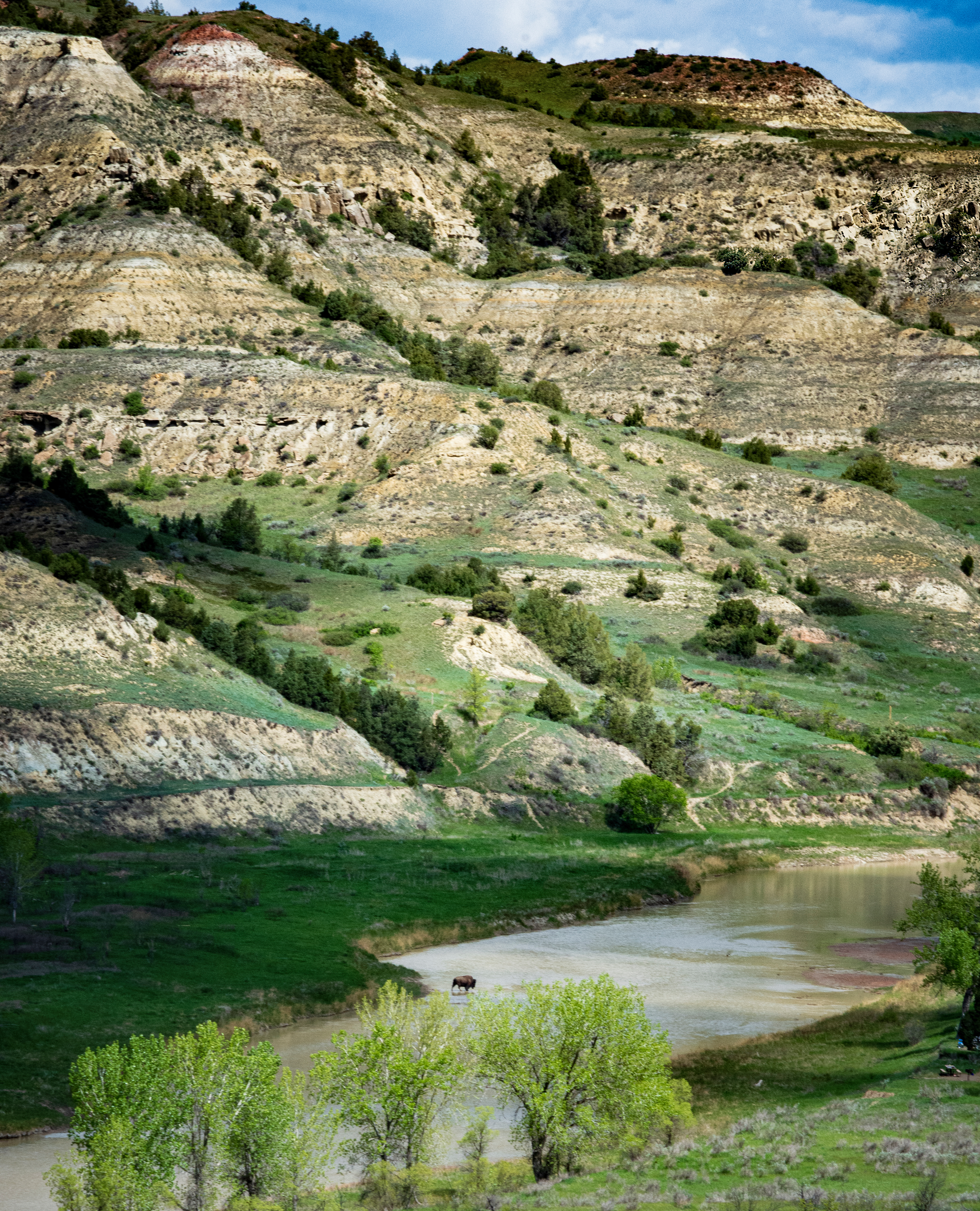
I, for one, can look at rocks and all its details – and there are details in this one.
The shrub, however, does not give me anything to scrutinize. It is both diminutive and understated which may contribute to almost blandness. This said, it is not because of its own lacks, but the imposing amount of detail and contrast it is surrounded by. So it seems its placement in the middle does not favor it, as it gets no ‘spotlight’.
However, as I keep staring at it, well, it’s growing on me – though not immediately. it’s almost as if my eyes had to adjust. Perhaps a spot treatment may help stand out?
My $.02, FWIW.
And decent eye focus too! Looks shot ‘from the hip. I like it. Somehow it strikes me as apossible that the day was brighter than it than it appears? If so, I’d brighten just a tad.
If it’s focus (hit or miss), then some part of the image should be in focus. If not then I’d proceed by elemination using g a tripod vs handheld on same subject, different focus settings, different lens, etc… And see what that returns. As wewl, You can rent a lens for a weekend see if any difference. Post an update.
Works rather well. And even better on Flickr with the larger/full size. I particularly like the contrast in texture and size.
Philip, I like this very much.
The minimalist color and decor works in your favor. I do get this ‘noir’ ambiance. Framing is great too and it’s a good balance. Sorry, I have no helpful criticism.
Looks to me that all you need is a print and a frame 🙂
Love it!
Like the pose and the composition, love the colors.
Initially thought the foot would not detract… but it does some. The whole left foot is right behind the cut off one and detracts because something is missing.
Rob summarizes this pretty well, IMO.
Still, a polarizing filter plus a ND (10 my pref) could paint another picture of this scene.
Christian,
WB looks good to me. The above horizon portion (sky) looks great and I would not touch it. IMO, a grad filter to make changes to the portion below the horizon: Clarity, highlights and shadows. And also might add some detail esp to the leaves in the foreground by the water.
This ia very handsome photo, by the way. Very nice.
Must agree (didn’t think so at first – thanks Gary)… off with the bush!
this is a most enthralling view.Hi, I would start with trying some ‘dehaze’ on the mountains.
Some fine dehaze like that offered by Studio might give the mountains _and_ the fliers more presence. next step would depend on the results.Most unusual car shot – at least for me. And I like it. I find it very satisfying; the colors give it a certain not-car-ness that I really like – kind of tired of the same old boss car shots. Yea, the branches… I’ll take’em too. They make it cool with a touch of green :-).
@Frank, I love the foreground detail. The lighthouse _is_ evidently the focal point. Something about the proportions, though, does not jive visually for me – the size of the lighthouse is such that it can look like a huge toy deposited on a rock – which, evidently it isn’t. Was this cropped much? do you have any extra sky real estate? Great picture!
@Dahlia Ambrose, thanks for the suggestions. Will give it a shot. Thank you.
@Frank, I love the composition and foreground detail. Just a bit of cropping up to the mast reflections in the foreground would do it for me, and maybe just a bit of brightening of the horizon – maybe.
@Tobie. Oki. thanks.
@Frank, I did a bit of work with your suggestions in mind.
Think I may have overdone the bottom left… looking at it some more.
https://www.flickr.com/photos/107087066@N06/36519596142/in/dateposted/
-
AuthorPosts