Forum Replies Created
-
AuthorPosts
-
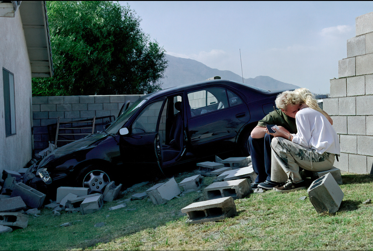
I’m having trouble differentiating the tractor’s grill, headlights and motor from the barn.
They look disjointed from the rest of the tractor, and almost look like they are part of the front of the barn. It to me looks like the barn has a black door with a door step and two lights.
Hello
I love any shots of animals/wildlife.
Sorry but I’m going to be harsh..so brace yourself..please don’t hate on me
This is just a snap..with little to redeem it.
I notice you say you shot it from the car window..it really needed to be shot from further around to the left to allow for some background separation especially so the left wobbly and the tree behind it ..As said, camera setting all wrong and so camera shake and also movement in the subjects..Fact is I think the “sharpest focus” is on the background..
If the fence is a problem it not a good shot from the get go..
At 250 on crop sensor u should be far enough away not to startle them, get your settings right, and rattle off a few more frames
Composition wise there is no energy an the subjects are inanimate an quite boring..
The contrast is flat an dull.. no nice afternoon light or shadows the the trees or on the wobbly’s faces..
(ImageSniper reaches for his voodoo doll of Ashjob)
Its just a bit of a crop cheat and recompose actually..An I also thought that lovely ceiling you shot could benefit from a little more attention, but I have a particular style that may not be everyone’s cup a tea!!
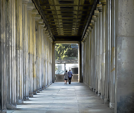
walkway-1.jpg by Ash on Light StalkingHi Gordon,
Last one before I go to bed.
Stunning cloisters, and I love the inclusion of the couple at the end..nice touch.
What sort of lens were u using and what at length was this shot?
Maybe some barrel distortion I have an alternate edit if you’re keen to see..
No rules really on clipping, use your eye, sometimes its nice to have a glimmer of specular highlights to make the image come alive an sparkle. Not a great practice to have hots spots within a large highlighted area ..especially if you intend to print.
Also, if I was to “present” this image, I would clone out the blue graffiti writing on the railing, as I fin it a bit distracting, and slightly crop the top right a smidge or two..
These adjustments most likely will be totally wrong for a higher res or RAW image
Screen shot 2014-10-16 at 9.17.30 PM.png by Ash on Light Stalking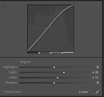
Screen shot 2014-10-16 at 9.17.57 PM.png by Ash on Light Stalking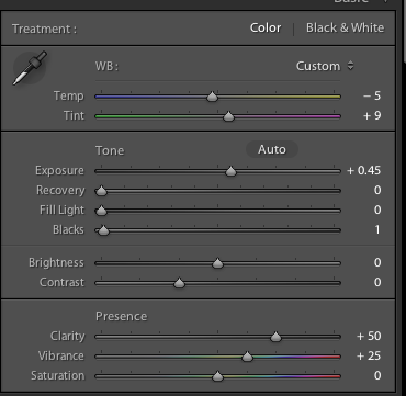
Screen shot 2014-10-16 at 9.18.20 PM.png by Ash on Light Stalking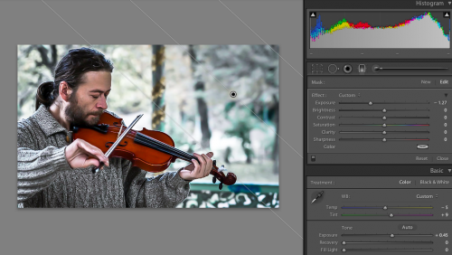
Screen shot 2014-10-16 at 9.19.34 PM.png by Ash on Light StalkingGreat Start..
Good initial impression …then……
Biggest problem as already stated, is the eye is almost demonically dark and unless that was yr intention, its a fundamental thing to get right.. In the studio there are no excuses cos you are in control of the light..
Too much black/loss of details in the shadows.. and the high lights a little bright..
did you have a concept or intention for the image,…… hat, chair, smile, low-key, child…bit of a mixed bag..
Keep shooting..it better than my first effort in the studio..
Hello
Nice capture,
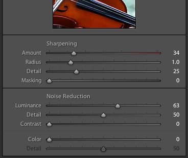
May I suggest a few quick fixes..
Colour balance and white balance to make the image seem colder and crisper.
Pull up the highlights to bring out the details in that jumper..sharpen ..then noise reduction..selectively enhance some other highlight/skin tones..
5 minutes here’s one I prepared earlier
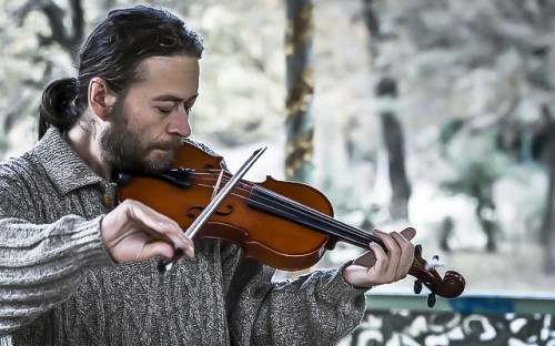
violinist-1.jpg by Ash on Light StalkingYou ideally needed an assistant to reflect some fill light dont the subjects face.
Hello
I like the mood of this image that u have created
Have you considered throwing it quickly through LR.. maybe BW
Your image was small but I ha a quick go anyway. I hope you dont mind
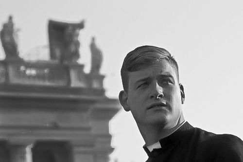
brother-1.jpg by Ash on Light StalkingAugust 4, 2014 at 8:36 pm in reply to: Appreciate your critique on the following Photo please #145468yes the wording of the museum gets lost in not only the background but also by the background being too dark. I don’t mind the blown out sun, but the exposure balance is wrong. Foreground is fresh and clean b/g is dark n dirty
Too busy..Foreground ugly.. I actually don’t mind the color balance.
Hi
In relation to composition, this shot IMO doesn’t work at all. Fragments of every element and nothing to hold or direct attention. Its not vertically str8 and the textures aren’t contrasty enough. I think you needed to bob down and maybe have the whole chain as the feature element. Odd choice of crop too..
I only used the 500pix version but here’s a 2 minute edit
 Screen shot 2014-07-31 at 8.31.56 PM.png by Ash on Light Stalking
Sorry but its too snappy IMO.
Perhaps try a different time of day,, morning/evening, and as said get more interest in the door way..try maybe also blending a second exp+2 shot…
Whack it into lightroom (if available) and have a play around.
@jpninanjohn I agree with you but that was the opportunistic shot that was on the run..Post prod can bring the yellow background down..bit of selective brush to reduce a combo of either saturation, lightness or sharpness.
I’m new here ..so reviewing older stuff….so bare with me please ..I always got in trouble at uni for finding “issues”
I have a paradigm…”subject or scene” this is I believe the latter…
I would love to have seen this in landscape format..so yeah why portrait?
….or load it into Lightroom (if available) and use the “punch preset” and then adjust according to taste.
Nice capture..I think the colours are true to reality and a dry arid environment Sort of thing that you may see in NG..I love the space where you left the bird to land.
For some reason I prefer the first image..not sure why…
tick!!
I actually really get this image. For my taste though.. I would crop in tighter right an top proportionately removing some background as well as cutting the top of the head off a bit..
Nice lighting
i agree with the f22 anomaly..(maybe its been seriously cropped) ..However I like this very much
-
AuthorPosts