Forum Replies Created
-
AuthorPosts
-
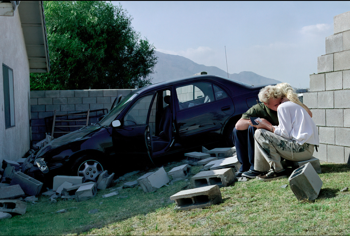
What a hoot! Lol These things happen, what do they call it Murphy’s Law or something like that. Can’t help but wonder does that exiting leg belong to inattentive mom? ( rhetorical ) well, wishing positive wishes your way and good luck with the outcome!
The baby’s shadowy face could be brightened, there’s way too much roaming space around the baby you almost lose what the subject is. If this were a action scene from a directed foreign movie this would be apt but since it’s common still shot of a babies drawn attention cropping is essential. After lightening the photo zoom in and crop whether you desire vertical frame to capture the face and body or to square off the face by tight close up is up to you. If you are really savvy and have photo shop I would match paint over the dogs leg in the background for this will show up when you go to enlarge the precious face in the photo. Good luck!
I’m thinking one of two things..you purposely underexposed the photo to give the stone an old ancient look. The distortion was a bit overdrawn much the same way color can appear to bleed if over excessed. Here over distortion is detected in a glance and can be corrected by taking three experimental shots of the same building. Each shot increasing distortion and by comparing images side by side you are able to know when you’ve overstepped the line. The symmetry, balance and distance of the building are a plus if you like front flat elevation views. Angle is key, perhaps a slightly side view would have been more preferred, this would have brought the curved walls out. The time of day you chose was perfect for getting the sun to stream in through the curved walls. I’m hoping you took more than one shot of this glorious building. The photo too has an uncanny resemblance to a vintage postcard if only it were brighter. Best
As Architect Designer I am well aware of your being drawn to point perspective. It is a wonderful way to see the world in super 3-D. Many Marvel comic books show extreme and distorted angles as you speak of and there is a right and wrong for shooting a desireable perspective shot and its all in your choice of angle. The shot you present here is called a worms eye view and it doesn’t really pull the viewer in and appears a clump triangle in a picture frame. A better approach is to take this same view from a mid higher vantage point. You get an even better shot if the 3 points in the perspective are pulled away from the center and using a “fish eye lens” In this I mean picture a model cube centered in your photo, now picture the cube slightly turning left and descending slightly to the lower left side of the photo. This is one choice. Another would be to repeat the same method of the cube but switch to the right side instead. This is known as the preferred birds eye view and you feel a comfortable sense of seeing the whole of everything than you would from a worms eye view. If however you still prefer the worms eye view repeat the cube method by raising the cube to the left or right of the frame the same as you would for the birds eye view. Your sure to have the right angle. Good luck!
Sure thing.
You may discover a surprise if you square the photo starting from left side. Crop a bit off. Then crop the right side to conform to a square. Your photo may have better impact and appeal. We are accustomed to rectangular shots since cameras are built to produce them but often times we overlook the simple square. Many a prize has been won over a square shot image and yours may be in the running. Good Luck!

Four units starting from the base up along the length to the fourth unit then cut away.
Tree branches at top are a bit busy, the bike is almost out of the scene..yes I see you put it on the golden section but here’s a tip to resolve both. Divide the base of your photo into three units and count four units along lengthwise. At the four mark cut away your picture. This will remove the busy branches and raise the bike center stage. Let me know what you think.
A natural tip I would recommend as I do to those I photograph is to use your eyes ( you have beautiful eyes don’t hide them) use your eyes to smile. It is the eyes the viewer sees in portrait shots. Be natural as you are when sitting or it comes across artificial. I recommend finding photos of popular actresses who have done portrait sittings like Penelope Cruz, whomever you are drawn to and I’m sure you will take a winning photo. Good luck!
July 18, 2013 at 8:33 pm in reply to: Jeesh – Looks like the regulars will have to take refuge in the General Forum! #97129I caught Light Stalking from an advertisement on flipbook and right away checked it out, so here I am and I like it so far. I made mention of your group to my photographer Facebook friends and welcomed them aboard explaining the rules using only constructive critique. Hope to see some of them here. I’m not a paid for photographer but am good for what I’ve learned over many years as professional musician, the art of photography is a bedazzling realm of silvery surprise, the wonders of the sphinx puzzle unfold, like a child gazing toy marble tiger eyes on a sunny Saturday morn I love photography and can only humbly boast the thousands of photos I took before I realized the hundreds of errors that followed. Anyway look forward to being a participant aboard and sharing some of my own work for critique. Look forward to making new friends too. Best
The cropping aspect is a bit elongated would crop a bit a left, agree with Caime would’ve liked to see more hair up top to make the picture more complete and balanced. All rest aside you have a warm smile.
Grandeur to behold !
Stunner! Keep the fence, at first glance the fence is undetectable and if anything adds to the aspect ratio where the eye is quickly drawn to the glorious sky
Too much unwanted space at left crop roughly a third off. The light value could be increased to make the birds white feathers pop and perhaps increase the saturation a bit to bring out the blue backing, careful not to over saturate. Good luck
Best regards
All the essential elements to this photo are present. You even managed to achieve a subtle diagonal flow across the image that draws the viewers interest in.
July 17, 2013 at 2:49 pm in reply to: This memory cannot be reshot…can iI improve it in any way. #96764No do not crop the tops of trees.. Picture 2 large imaginary squares inserted into the base or length of your frame then picture once again 2 large squares inserted to the top of your photo.. The imaginary tops of both squares should align to subtle lines running across the photo. A third element is needed however to complete the finished photo, the golden section. Where you stated you cannot retake this photo it is a done deal. Even if you corrected the cropping the golden section will move out of place. More specifically the golden section is the yellow valley in the background, you will throw this off by cropping the width. But now you know what to look for next photo shoot..
The leg is a definite imbalance and needs to be cropped out, zoom in on those birds to show detail.
All the elements seem to be present but would soften the black foreground at left of photo
-
AuthorPosts