Forum Replies Created
-
AuthorPosts
-


I have been trying to get a handle on this sRGB color space. If this picture is viewed using IE10 it does not show the color correctly, If view in Firefox the colors are correct but a little too saturated. In Opera 12.16 not the correct color and in Chrome 3.0 ? still the reds are muted but as bad as the other web browsers.
This must be indicative of how different browsers interpret the sRGB color space. How you can control this I have not found out as yet.
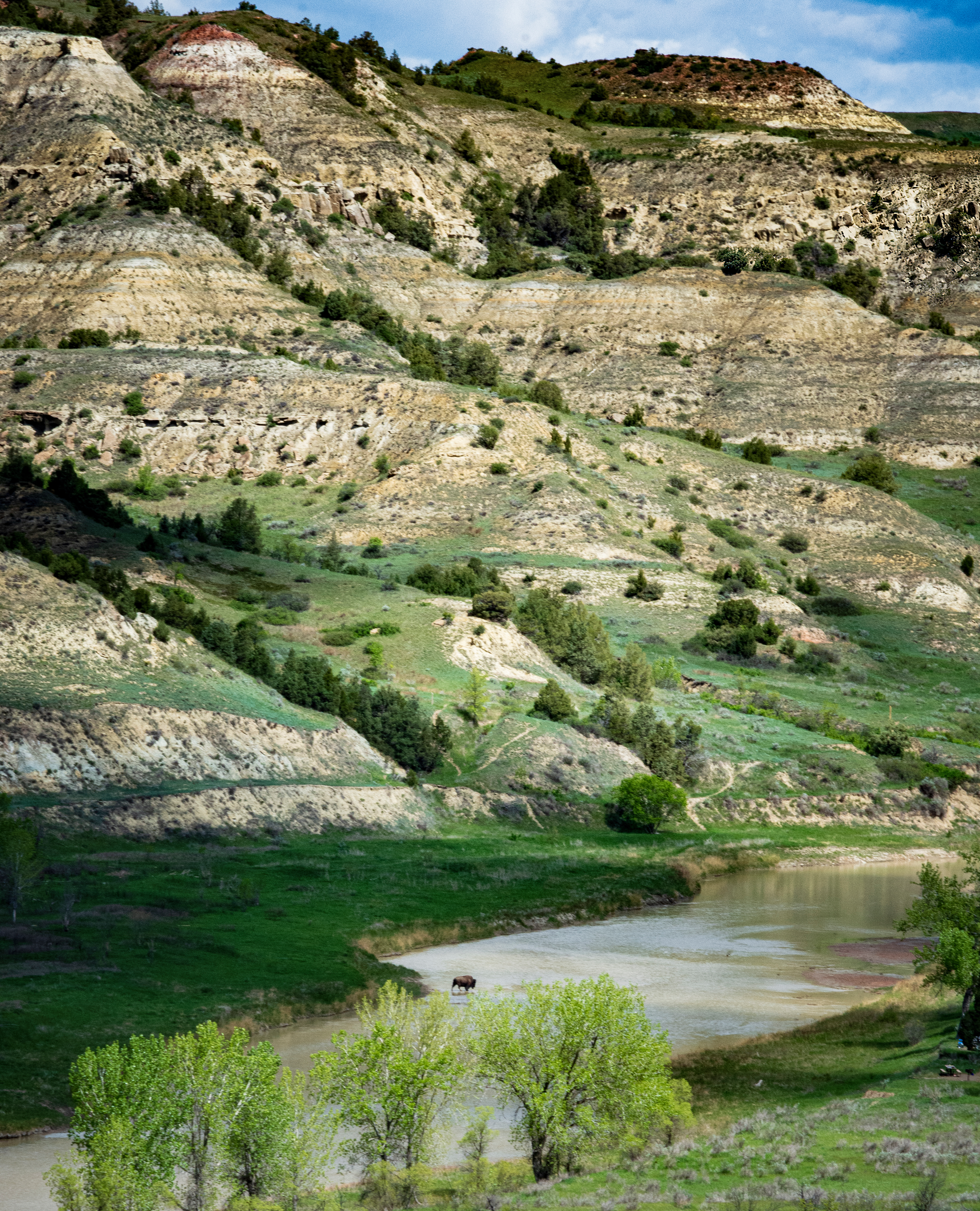
 Danties_view_5720_500.jpg by Tim Pinckard on Light Stalking
The tops of the ridges should be a deep reddish brown color, when outputted as a tiff the color is there. If I open the file in Firefox or Chrome the colors are there but not in IE10 or Opera.
I shoot everything in RAW and open in Lightroom 5.2. Soft-proof in sRGB with a 50% gray background and the colors are there.
The one thing most impressive about this area of Death Valley is the deep colors, the reds are almost shocking in a brownish rusty way.Canon EOS50 D
E-FS17-55mm @28mm
1/20 @ f11
ISO 125
Aperture Priority
5:26:36pmThanks, I think I have done all I can (want) to do with this one. On to another. Thanks again for all your help, I learned a lot and more importantly to be more aware of the horizon.
September 12, 2013 at 2:41 am in reply to: How to Share a Photo on the Light Stalking Forums #106275I have been away from my computer for the last week and boy have things changed. I noticed that there is a size limitation of MAX 500 Pixels Width!. This is not bad for a shot in portrait node but limiting for a shot in landscape mode. a MAX 500 Pixels for the short side would work better.
The ability to upload a larger version of the picture for use in the Shark Tank was very helpful in giving feedback. Could this feature be brought back maybe just for the Shark Tank? Now the only way to upload a picture is to your album and the post to the discussion. For the Shark Tank could the ability to post a larger picture be available in the reply box only, like it was for all posts previously?
@michael-lloyd thank you so much for the detail comments and instruction. I have been away from my computer for a week so was unable to reply. I have tried to incorporate as much of your directions as I could and still maintain the look I wanted. How did I do?@jonathantimar thank you for your comments, sometimes I cannot see the forest for the trees. Now that you have pointed it out the horizon is definitely crooked. I will look at it again and do a little patching in Lightroom. Also I will try to get a bigger picture to post.
Thanks again.
At first glance, I totally missed the dog. The large tea pot left front keeps dragging the eye away from the actual subject. Overall a little dark for my taste.
Thank you all for your comments. I have re-cropped and adjusted using the Topaz Labs clarify filter.

For me the perspective is off and I feel that I am falling into the picture, also the section of white sky and top of the building is a little distracting. If this was cropped, I would use the un-cropped version try correcting the vertical perspective, then cropping. This possibly take out some of the white in the upper center and bring your eyes back to the center. Just a thought.
I agree with most of the comments. I find that the area of the right eye is too dark and distracting. In photographing animals and people that focusing on the eye gives the best results. If the eyes cannot be see or are not sharp detracts from the overall impression. If you have Lightroom and especially Lightroom 5 there is a wonderful vignette tool that you can invert the vignette, adjust opacity and hardness to concentrate on the area of the eyes to lighten them up. This can also be done in Photoshop but a bit more difficult.
The white in her dress is blown out and very distracting. See if you can recapture some detail there and darken it. The hair around her head blends with the background d gets lost, more detail here would be nice.
She tries to update it regularly but just doesn’t seem to get there, last update was in February. She says she is working on it. Maybe and update soon.
Yes the face is a little out of focus, but this possibly is not a bad thing. Years ago before digital we use to shoot some portraits through panty hose to soften the image and give it a dreamy feel. With the advent of digital, we seam to only want tack sharp shots. I think at times, like this, a little softness is good.
I agree that it appears to be a little tilted to the right. It looks a little washout and I would add more contrast to bring out a slight more detail.
I want to thank everyone for all your great comments and suggestions. I have to agree that these are not something I would print and hang on the wall. I will use them to include in my wife’s blog of our travels.
Thanks again to all for your comments. I did learn a lot.
I would crop the dark clouds at the top. My eye goes to the bright sunrise then to the dark clouds, I feel like “What is that over my head”. Other than that I like it.

Here is one closer of both falls. It was taken from the observation platform as far to the right as I could get. Did very little in Lightroom, applied lens and camera correction using the default values.

This is of the largest left falls from the same distance as before but a slightly different vantage point.
You may need to up the ISO to get to the correct shutter speed. I have found that if you are in a good spot to see they for a short distance planning with they helps. Use high speed burst mode and AL Servo. I have found that converting to the rear button focus and only using the shatter button to take the picture helps. This way as long as you hold the focus button in, in AI Servo, it continuously focuses and in burst mode and panning the subject works out really well for me. I get at least a couple of good shots each burst.
This is all assuming that they are on a track and you are at track level or a little above.
-
AuthorPosts