Forum Replies Created
-
AuthorPosts
-
The hand does need to be in better focus. The main problem though as others have stated is that the light seems to be coming from the left for the cat lady and the front for the hand. Since you are compositing, there probably could be a better background too.
Brad that looks a lot better! Didn’t realize I had that much room to bump up. Dean I’ll try and move about a bit if I get to go back. Great tips from you guys!
makes sense. thanks for the feedback. I guess it doesn’t have a central subject as you said.
I agree that the right building should be cropped. Great atmosphere but this might be one where if you were closer to the buildings, it would have been more powerful. Boosting the contrast might make the clouds pop and you really don’t need to see through them for the image anyway.
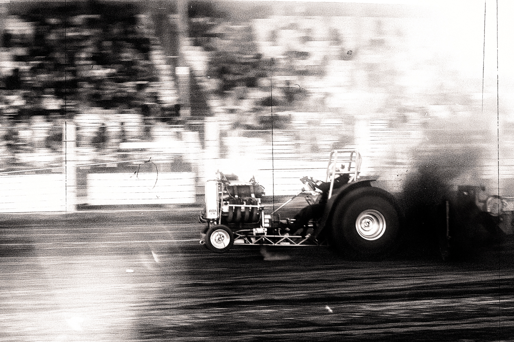
The red is distracting but I think the biggest problem is nothing is in focus or its motion blurred. Water drops look great pin sharp distorting the objects behind them. Maybe a direction light would have helped too with the flat lighting and colors.
While I think they both look good, I like the color one better. Just have seen too many B+W of weather beaten people or B+W portraits period.
I think technically it’s a great job. I’m not sure what the connection of the elements is, but I’m still stuck in the concrete phase of abstract reasoning.
I would crop it so that she and the columns were all that was visible. It simplifies the composition and draws the eye to her more. I just don’t find the rest of the background very interesting.

I think it does look better cropped in with just the musicians. The people in the background distract from them I feel. I guess they were too far away from the background people to get the contrasting effect you were looking for originally. It became 2 pictures instead of one unified one.
Thanks guys, that does look more impactful for sure. I have a brighter exposure so I probably can work with the sky. I guess I did over do it with the polarizer.
Feel like the splashy bits are neither here nor there. Too long an exposure to catch fine detail of the spray and too long to be silky. Also there are transitions between your blend surrounding the wave breaking over the rocks. The rock in the lower left corner is distracting imo.
It’s a very nice shot. The HDR blending takes a bit away as I feel the mist in the back and trees that are sunlit aren’t as accentuated as it would be normally. Otherwise great composition and congrats for finding a great spot and time.
-
AuthorPosts