Forum Replies Created
-
AuthorPosts
-
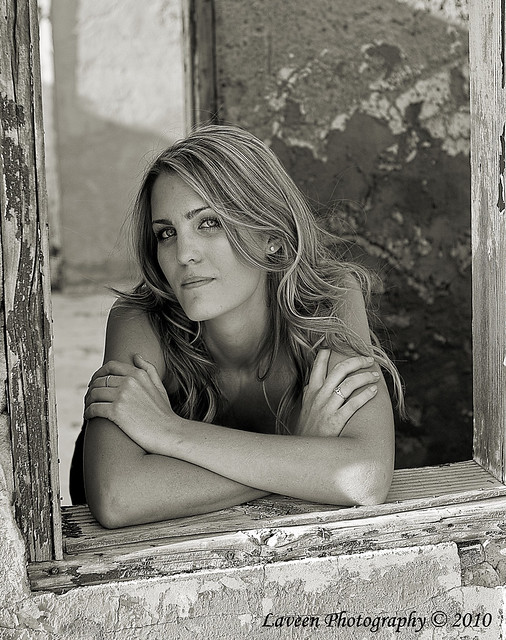
Yumarena, thanks for the comments. It has been a while since I originally edited this photo. The tree trunk should be easy and I agree with reducing the highlights. I may also do a bit of burning on the light reflections on the foreheads. I do not remember if this has been cropped at all or not, but if so, then I will also look at adding headroom. Thanks again.
That is really all it is for. I am tending to move away from them again.
I agree with @Str8aero’s comment about keeping the photo alignment in its proper perspective. I would also tend to either make the entire photo color or b&w, but not selective. I will admit that the selective coloring does make the skateboarder pop and draws your eye to him. Given this perspective, I tend to disagree with @Illes.cristi about the cropping. If nothing else it helps convey the height of his jump.
I go back and forth on watermarks myself. I try to make them visible but not overwhelming.
I am new at shark tank and I ready where we have to be negative, so maybe I will think of something to critique, but I really like how this came out. I think the cropping worked very well. The head is where you wanted to focus anyway, so cropping put you there. The gray in the lower part looks more even. Well, I am sure someone with a keener eye might come up with more critiques, but I cannot. I like the choice of a square format too.
The re-edit is an improvement. @Yumarena’s comment about burning gets to my first thought, both sides (corners) but especially the left are distracting. My original thought was to consider cropping; however you would loose a bit of detail in cropping off the legs. In lieu of burning, or in combination, consider just lowering the highlights, but keeping the mid-tones and darker areas as they are.
It is a pleasing photograph but I think what I notice, or do not notice, is anything to really focus on. It is a nice landscape but there is nothing that draws my eye. Actually the eye is pretty much drawn to the sky and clouds in the center, which I do not think is what you want. I also find the reflection distracting. Given this exact photo I would consider cropping the bottom off, maybe just below the log and make it a bit more of a panorama. That would remove the negative space in the foreground and the bright reflection. That would also, I believe, give more attention to the mountains.
@Nikon-Nut, good point, though I like the anonymity that is created by some smoke covering her face. I like your idea of a slightly turned head to give a bit more profile and lighting on her cheek. I think I could have also let the smoke rise a bit more. I did want to get the light highlighting the smoke, but I would have accomplished that by letting it clear her face a bit more.
I will first state that I realize that often a photographer is a victim of their setting and may have little control, but that is when it becomes challenging. Several things catch my eye in this photo. While it probably was not the first thing I noticed, it seems to be the think that bothers me the most, the photo is not exactly straight. This becomes a distraction for me. Next is the problem with the overall setting: the wooden floor, the blue tape, the trash can, and the umbrella hanging on the wall. One of the first suggestions I would have would be to not shoot a full-length shot but zoom in and get a tight shot of her upper body and try to have the curtains across the entire photo. While there would still be the gap in the curtains there would be a uniform black background and you would eliminate a number of distracting items while still capturing some of the fashion.
Another thought might be to have moved to your left and try taking the photo from an angle, possibly blocking out some of the distracting items and keeping a full, black, background. Also, if you take it from a lower position you may get more of the full length of her body or possibly 2/3rds. The only challenge comes in capturing the shoes, which I like their design.
I really like the shot. I agree with the comments about it being too soft. I would have preferred something that was sharper in focus. While I also agree that the paint is a bit distracting I also recognize that this is a street shot. I do not know the background behind the shot, but if you had staked out a place to photograph and waited for an opportunity to pass by, then I would have shifted my location. However, if this was taken as the two of you passed then you have to take the shot when you get it. That then leads to the suggestions to edit out the white patch. For me, this is more of an journalistic styled shot and I would tend to leave it as it is. The paint on the wall is part of her environment.
@adhalsey That is exactly what is happening. This photograph was taken with a 105mm lens from about 17 inches from the grapefruit at f/4. The DoF was intentionally very shallow. The leaves that are almost in focus are within a few inches from the grapefruit and the rest are, in relative terms, much further away. So, most of the yellow and green tones that you see are not color aberrations or off-toning, it is very out-of-focus leaves. I believe that the bright spots are just breaks in the leaves, but with the focus so shallow they appear more as bright spots or sources of light and not just breaks in the vegetation.
@el-dub Thank for the suggestion. I will try the burning and see how it comes out.
@riteshsaini the challenge did affect how composed the photo. In brief, I was to take basically a macro photo with the background as blurred as possible. So, I looked for and took a variety of shots, but by necessity, it was hard to not place the in-focus subject to the side or corner of a photo. What caught my eye for this shot was the lighting through the leaves and also the reflection off of the grapefruit. It very much reminded me of some of the still life paintings I have seen. As far as the color, I believe it is fairly close to what you actually see. The leaves have a lot of yellow and green in them, as does the grapefruit. All of the blur in the background are more leaves with the sun coming through in spots.
So, the short of it is i pretty much agree with everything you said (though I like the color – actually my natural tendency is to get photos too warm with too much red). I think I primarily posted this photo to see how much the photo’s compensation turned people off. Thanks for your feedback.
Interesting conversations. I like what I assumed was your original. I am unsure how you ended up with a RAW photo from what I though you said was a cell phone photo. I like the basic photo you started with. The reflection on the nose is something I noticed from the very beginning and would dodge it a bit to tone it down. I might have also tried to increase the lighting in the shadows on his head on the right side of the photo, but left the rest alone.
What seems to catch my eye is that the rock formation in the background does not look like it is in focus but the rock in the foreground looks to be more in focus. I also find it far more distracting than the home down in the valley.
I found myself scouring my photos to see the photo that I know I have from that exact same spot, but not sunrise. I love the composition of the shot. The only thing running through my mind as far as ways to improve it is to have not to have used the graduated filter. You almost have a contradiction going on by boosting the contrast but then using the graduated filter which, in essence, minimizes the contrast, at least between sky and foreground.
I agree with the composition comments and think the one about getting at eye level is good. But, that aside, what I noticed is that you also cut off his hind quarters. It improve the photo, taken from the same perspective and location, I would suggest having shifted the camera view up and to the left so that the dog’s whole body was in the photo. That would have also put his head about in the lower 1/3 cross point (rule of thirds).
You also asked about the exposure. Sometimes dynamic range is so great you cannot get the dark areas light enough to not get other parts too bright. My suggestion would be to expose for the shadow area but make sure you do not totally blow out the area on his leg, which you did not. Then you should be able to reduce the highlights enough in processing to bring out more of the detail in the leg.
My initial reaction was similar to parhampbaker’s. I like the composition and framing of the shot. My thought was a bit more broad based in that I would prefer if all of the colors popped more. Regarding your question on the cropping. I like it. I think it frames the falls nicely and it is essentially a “normal” photo dimension (5×7). I think the crop is fine.
-
AuthorPosts

