Forum Replies Created
-
AuthorPosts
-
I had to look long and hard at this and I think I can feel what its trying to do but I dont think it makes it for me. The arms in the wall blend in too much and seem a bit of an afterthought, when they could be the highlight of the photo. I am not sure how, but if it could be edited to make the arms appear as though they are coming through the wall rather than just stuck on it, I feel it would convey the “jailer” feel better. Only my opinion but its not my type of photo.
I would have to agree that the central position of the boat leaves me feeling its a bit empty, less of heading out into the unknown and more, well empty. I get the detail in the water in the foreground but ti doesn’t make up for the all the negative space. I would have to agree with trying a landscape crop and have the boats bottom right 2/3 of the image.
Thanks Graham, one to experiment with then I think.
Yes , subtle but effective its taken some of the excessive sheen of the glass and from around the silhouette. I used a flash with no moderation to create the silhouette as I thought the point source would be more effective, any opinion as to whether a soft box or umbrella would have been a better option?
Hi and thanks for the comments, really appreciated. I would love to see you edit if possible.
D’oh, damn that predictive text😀
Thanks, I will try your suggestions out and the sharpening seems to be a common thread amongst the contributors so that something to sort out.
Thanks for the reassurance, I will do it in future.
hi again and thanks for all the comments, it is always helpful, I didn’t even notice the green cast which might be more to do with my eyes than anything else. I will think about altering my setting to let people edit the shots but whilst if is good on here there are people that might abuse that privilege
Thanks again though, every day is a school day:)
For what my opinion is worth I have to agree a lot with what Bucweeet has done wit this image. The original has a rather flat look to it and I would have added a lot more contrast. The drama in Bucweeet’s rework certainly appeals to me far more.
February 25, 2018 at 12:47 am in reply to: Silver fox, Candid shot of a guy I thought had an interesting face for a B&W #330853Hi Ian, well this guy certainly has an interesting face but there is something unreal about this shot. There seems to be a “halo” formed by his hair and beard that gives the photo a ghostly look to my unprofessional eye. There also seems to be odd spots, like the left temple area, that seems blurred for no apparent reason. May be more contrast and grain effect in the face would add some drama, it seems a bit flat to me. As a candid it has interest but points I make seems to take the edge of it for me.
Just as a pointer people on here like to see the camera setting you used in the text.
I saw this on Flickr first and do like the shot but I am not too sure about the vignette, maybe a tighter crop on the UFO also? Very interesting though
Thanks again for the comments, and don’t worry I wont be discouraged, this is the place for quitters is it?
I will take everything on board and try similar shots with my real camera, the background is that my wife was just in this position and it was too good a shot to miss. The iPhone was all I had and some time later here we are. I do appreciate the comments, and thanks for the support Falxy
Thanks for all the comments, which to be fair are useful and point out some thing is ought to have seen myself. I can’t find the original image now but it was just a standard photo and then I messed about with it. I will have togo back to the drawing board with this one, fortunately my lovely and long suffering wife will help me facilitate another, more considered attempt.
Thanks again
Thanks and what you have produced is what I imagined, I have surprised myself:)
Excuse my foolishness, I thought this was in the shark tank I hope there is no offence taken here
This looks pretty flat, the rocks not he left are a bit too dark to pick out much detail and the sea is a grey and fairly life less. The action of the wave was no doubt impressive at the scene but in your photo it is fairly insignificant. I am certainly no expert but if it was mine I would consider cropping it tighter, leaving out the first section of rock in the foreground, down to the “fluffy” clouds in the back ground and leaving out a lot of the bland sea. I would try it in B&W or brighten it up. It would make the wave crash more of a focal point and hopefully bring out some the detail of the rock.
That’s just my opinion as an enthusiast. Enjoy your photography
I agree quite a lot with the above, the dehazing has worked well for me in PSE 15. Also I would level off the horizon at the lake edge. best of luck
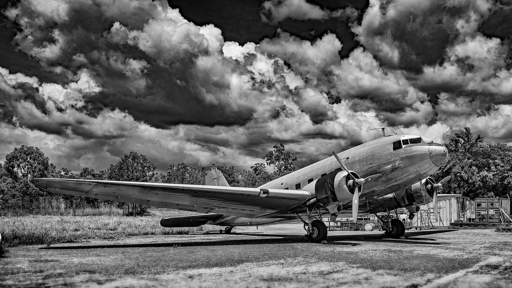
an attempt to bring some of the points to a new edit. I have de-cluttered the background a bit and dodged under the wing whilst trying to maintain a lot drama in the sky and hopefully have the aircraft stand out more. Thanks for the pointers.
 <script async
thanks for the comments , they all make sense and I will try to make some amendments .
Neil
There is, in my opinion , a lot to be admired about this photo. However to be constructive the thing that is annoyingbisbthrbedgebof the net that is visible below the fisherman and it stands out so much.
For me, the background detracts from the focus of the photo, it interferes too much.
That being said said if I had made it I would be high fiving all my mates.
Nice
-
AuthorPosts