Forum Replies Created
-
AuthorPosts
-
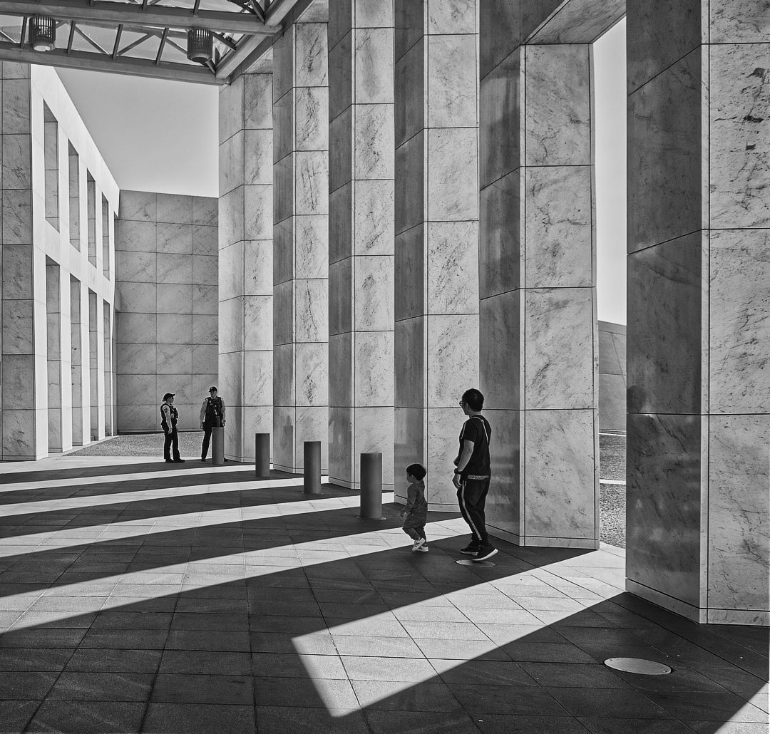
Here is the pic in Monochrome – B & W. I quite like it, will revisit it tomorrow. 🙂
Diane – Thanks, yes it is, but I have corrected now. I had gone rusty in how to do this, but after a bit of struggle I managed. The problem was that the verticals on one side of the pic were also different from the verticals on the other side. However, I used the Perspective tool in Affinity Photo and that worked great!
Patrick – re the ‘bright wall’ the Histogram for the image was fine, which was a puzzle. Nevertheless I have lowered the Highlights and it is not as bright now. Have experimented by cropping the left side out.
I will try Black & White soon, using the Nik Collection – Silver Efex and will post the result. Not sure what you last sentence means?
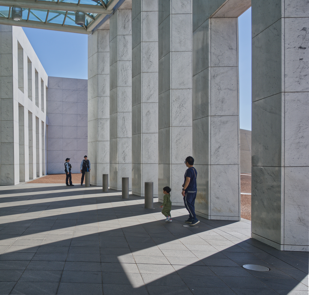
Did mull over suggesting B&W, but think that the colour mix works very well and does not obscure the story.
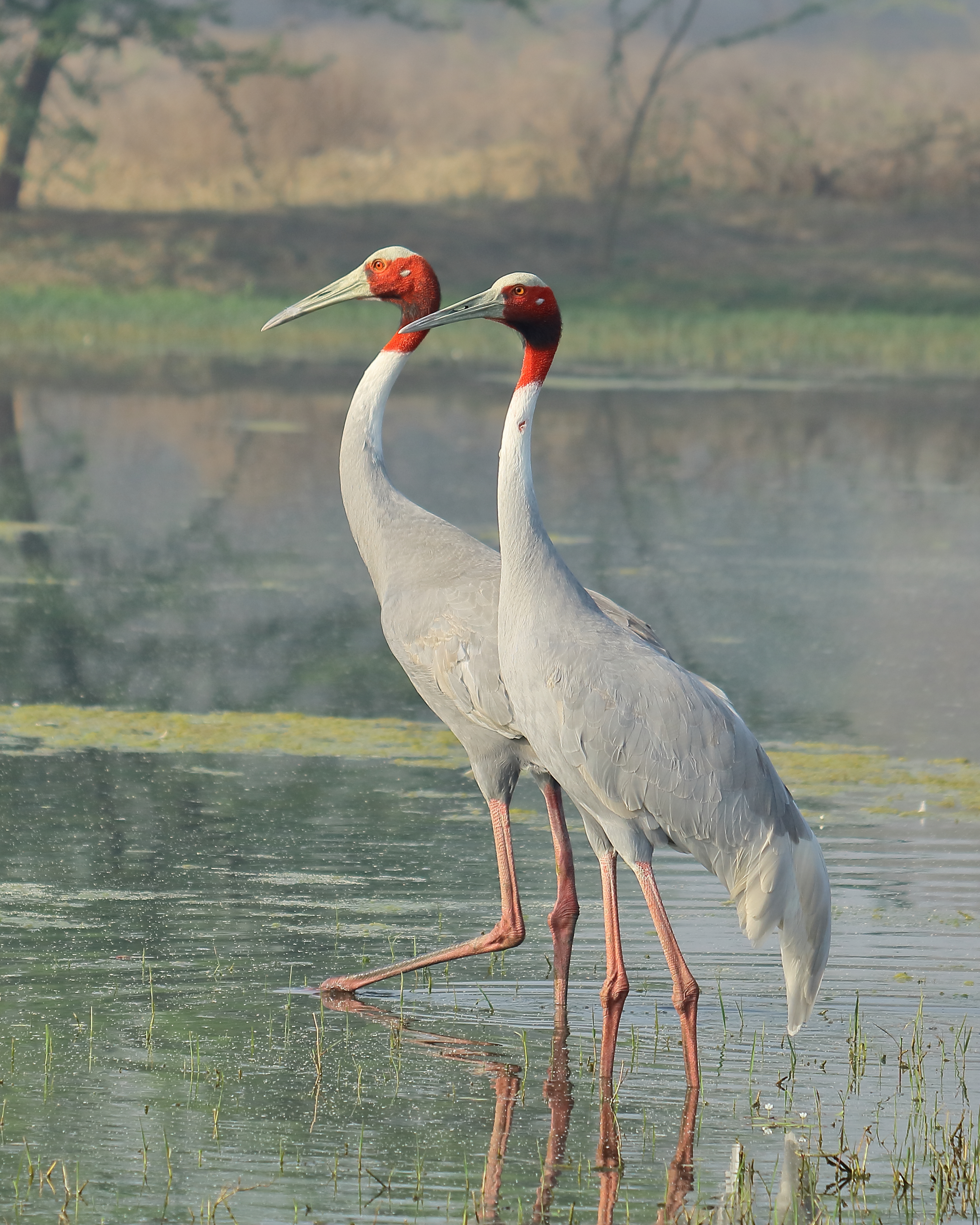
Wow, a capture in a million, very well done, Pat!
Great introduction and summary, Federico.
I like the last image, Erik, four people in their own crowded worlds! The lady on her cellphone, the guy dozing, the lady wondering what to prepare for dinner (though hopefully her husband is preparing the family dinner!- it sometimes happens). The guy standing up, praying for the next stop to be soon. All crowded together, great story.
I really like the subject nature and the crop, Erik. The only thing that disturbs me is the round glow of light towards the top, just beneath the angled girder. I would get rid of it as being a distraction.
Hi Diane – Did I crop? Certainly did, the result you see is approx 1/36th of the original. Have just measured and it is very clear that was a very bad move. In the days following I have moved a helluva lot closer.
Hi Rob – I did try moving the black point up, but because of the big crop the results were not good at all.
Hi Federico – I take your points. As you will see I am learning some of these lessons the hard way, but much quicker because of this forum.
Hi Erik – the settings you mention are very useful indeed, so many thanks! I realise that they would only be a useful starting point, suitably adjusted for the particular circumstances at the time.
This image is sheer poetry! A fitting tribute, as has already been said 👌
Before I read your and Diane’s comments, I thought that it would be good to include more of the building on the left. I am not concerned about the cropping on the bottom.
I agree with Diane, Lenny, and that Dahlia’s solution is the way to go 🙂
I agree with Federico that the spot is a plus. Also with Rob about desaturating the blue.
I like both, but would remove the second gourd as not necessary to the story. Agree with L&S’ comment as I, too, would never think of the 2nd as ordinary!
Hi everyone, I feel a bit overwhelmed by all of the insightful comments and suggestions, it is all very much appreciated.
@federicoalegria Federico, your really nice comments about the colour palette (right image) and her expression are reassuring. Yes, I became aware later that the sun was in her eyes on the left. If the right opportunity presents then I will retake the shots. I was a bit higher than her on the left, so would crouch at another time. I was a little bit lower than her for the right.
@admin-2 Rob, agree
@loki – Beth, agree with your comments including that of “the repeating pattern of the rooftops”.
@dahliaambrose Dahlia, agree
@lightandshadow – the purpose, well I saw her one day outside of our villa in our Retirement Village and thought that it would be good to take a photo of her at that time and then later get a more ‘natural’ one of her in her normal working uniform. Then later that our village editor could use it in her weekly newsletter (which did happen) to portray her as one important member of the staff. Also had later thoughts that I might well take a third image of her in her wet weather gear, with the intention of making a triptych. Was playing it all by bit by ear all along the way!
@el-dub Lenny, yes, Covid has affected us all in some ways, each to a greater or lesser extent!Thanks @el-dub Mmm, not sure about the silhouette, but will give it a try, Lenny.
Thanks @dahliaambrose, wow, great spotting re the front shot not being the best, I will definitely look carefully for the best one at the end of my next shoot!
Wow, beth, some great suggestions, which I will definitely follow through on! Many thanks indeed! 😀
I really like the colours, Rob, plus the small bits of orange on the vehicle and also in the building behind. Actually, forming a triangle, which also helps to tie it all together. Maybe find the overall composition a bit tight- hmm, still mulling over that!
June 9, 2023 at 10:18 pm in reply to: Weekly Photography Challenge #645 Abstracts using Intentional Camera Movement! #513639Cool effect!
June 9, 2023 at 10:17 pm in reply to: Weekly Photography Challenge #645 Abstracts using Intentional Camera Movement! #513638Spell-binding!
June 9, 2023 at 10:15 pm in reply to: Weekly Photography Challenge #645 Abstracts using Intentional Camera Movement! #513637Really like this, Elin 🙂
June 9, 2023 at 10:13 pm in reply to: Weekly Photography Challenge #645 Abstracts using Intentional Camera Movement! #513636Very nice indeed, love the subtle colours.
-
AuthorPosts