Forum Replies Created
-
AuthorPosts
-
@admin In my case I am an agent and photography is a hobby. When I saw how bad some agents’ photography is I decided to improve my own. They clearly don’t have much regard for their service to the seller, so I’d like to offer better quality photography in areas away from where I operate. There are literally hundreds of agents and plenty of properties for sale – maybe it will catch on and enable me to grow a little business! @Karamen – thanks for posting your examples – they’re really good. I did a shoot yesterday evening and the results were much better (and quicker to edit!) thanks to your advice. Did you get a chance to look at the website? It’s scary how many websites there are with any number of brilliant photographers! But that doesn’t intimidate me, I love this hobby – it gives me such a kick when I get a nice shot 🙂 Keep up the great work!
Thank you @Karamen and @Tobiepsg. I’m going to do lots of learning PS and plenty more experimenting based on your suggestions! The website I was referring is http://architizer.com/projects/promenade-residence/ particularly the shot fourth from the top on the right with the pool steps in the foreground.
As an inexperienced photographer you’ve lost me with all the technical IR stuff, but is this composition right? The tree stump is right in the centre of the frame. Also, I personally find the border a little distracting. It’s still a great image and I keep going back to look at it, so I guess the composition does work!
Ok @tobiepsg. Done! I hadn’t noticed <<the highlights on the bird’s back and the top of its head>> and it made a big difference. Thanks 🙂
I like the multiple layered depth of field (if that describes correctly?) The foreground through to the distant mountain draws my eye to the subject. Pity one can’t just ask them to stay there while you get the right shot! That’s why I prefer landscapes – they’re so much more patient 😉 Having said that, we have lots of wild life on our doorstep here so I will now make it a mission to get some photographs of them. Thanks for the inspiration.
@falx and @Tobiepsg your conversation was very helpful. Thanks. I can’t manage everything you’ve discussed, but how about this? Straightened horizon, reduced shadow around head and bill, cropped bench out and added back the little available extra space to the right of the bird. Oh, and reverted to colour! I also took the advice of @nikon-nut and slightly increased the contrast. (Black and white was helpful with this!) I guess it won’t be perfect in everyone’s opinion, but I’m told there’s no exact right or wrong in this business, so I’ll cling to that theory 🙂
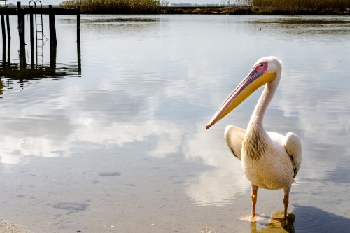
Pelican @Velddrif by David Adshade on Light StalkingThank you @nikon-nut. I’ll have a go at the contrast and see how it looks
Thanks @DavidN – I also discovered that calibrating my monitor helped! We live and learn…
January 19, 2015 at 4:19 pm in reply to: Thoughts, crits. I want to know what you think of this picture. #178928I also had to lighten up an image the other day. Maybe we’ll have to calibrate our monitors more regularly folks!
January 19, 2015 at 3:36 pm in reply to: Thoughts, crits. I want to know what you think of this picture. #178921I like the black and white one much better. Did you crop her chin off or was that how you captured the image?
I appreciate your guidance @gordonjames. I must say I’m quite pleased with it now 🙂 I’ve been looking at your work and it is brilliant! Your composition is what I need to take note of most IMO. However, I am thoroughly enjoying learning and aspire to improve steadily – looking at my Flickr photostream bears testament already. I feel like deleting the early stuff, but it’s a good gauge to monitor improvement by so I’ll leave it… for now. Au revoir!
Thank you @Tobiepsg! On the advice of @gordonjames, and after the crop change suggested by @grizzly, I made some more edits to the exposure and this is the result as requested. It’s helped me to learn so much more about tones, especially when converting to B&W to see the effect of the changes. Thanks everyone for the input 🙂 I guess this could go on ad infinitum, but I think I must accept this as the (possibly) the final edit and move on to the next phase of my learning curve.

Low Key Final_1.jpg by David Adshade on Light StalkingI really value your knowledgeable and constructive advice @gordonjames. I’m enjoying this steep learning curve! Since @grizzly commented I was able to re-crop the original image to add some more black space to the right, albeit at the expense of cropping off his ear. I think it works though? I have replaced the image in My Photos in case you want to see it.
The “soft box” was perhaps a little too close (or my speedlight was set too powerful) and because the exposure was quite high, perhaps I over-compensated in LR. Try keeping a two-year-old still while you play with your setup!!! Also, I chose to keep it in colour because, although I love B&W, I just wanted this one to be a bit different. For me, his eyes and lips are the highlights of the image (he is my grandson after all) 🙂
So, the plan of action thanks to your and @grizzly ‘s assistance, is to create a few virtual copies and play with the gradient tool to raise shadows, exposure, maybe dodge & burn selectively, B&W and so on. I will also be watching very closely for that “laid on its back P” in the histogram. Let’s see what I come up with and if you’re interested, perhaps check My Photos over the next few days and I will post some of the resulting images there.Thanks @grizzly for the comments. Unfortunately there was a fluffy blanket at the back of his neck that I cropped a little, cloned out the remainder and added a vignette. Pity the right side had to suffer as a result. Otherwise, I’m delighted that you liked it!
I also did this one although I don’t like the aspect much, but it does have more space around the face. Camera settings and setup exactly the same as in the previous shot.
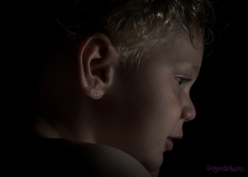
Low key first attempt by David Adshade on Light StalkingThe only negative comment I can think of is how this makes me realise how much I have to learn. What lighting did you use? I tried low key today for the first time (posted in the Shark Tank) and now super keen to try high key. Thank you 🙂 PS – I would also have lost the loose skin at the back left.
Hello Ben. I also joined a while back and posted then, but have not posted again until the other day. It would be great to see some of your photographs sometime. Try the Shark Tank. Very honest and helpful critique of your work! (Maybe you already posted but I haven’t checked yet) David.
Hi @sabina! I also got back into photography 2 yrs ago at 58 after a gap of over 25 yrs. The gear was a real learning curve, but having got into it I am enjoying experimenting without the expense of processing film! Software adds another dimension to your creativity. Almost limitless scope for making your imagination into images. ENJOY 🙂
Oh dear @tersha – seems that google are attempting to take over the world! Anyway, I found him on Flickr for you. If you don’t already know him, have a look at his other photographs too – personally I think his work is astounding

Thanks @admin for the video – I have been using the new beta version of Flickr and it doesn’t have the “grab link” feature (amongst many others, although in many ways it is very good). Anyway, I’ll go back to old version then. Appreciate your help! Maybe worth a mention in the instructions of how to post a link that you need to use the old version of Flickr?
@nikon-nut it has the woofer and two tweeters to look just like an old-school hi-fi speaker – dead right!
@michael-lloyd – thanks for the exceptionally helpful information. Seems my “retirement nest egg” is worth in the region of $15 – $25!!! Bummer…BTW @el-dub and @tersha it seems I’ll need to brush up on my ironing skills in future – thank you for your comments.
@nikon-nut I don’t have a printer myself so I take my images on a flash drive to have them printed. Having gone through numerous trial and error attempts at various places I cannot find any consistency to my print jobs and have to judge the best I can on my monitor before printing. The guys I’ve dealt with tell me that it depends on software and monitors and formats, but there is evidently no set rule that guarantees WYSIWYG. You’re not alone it seems!
-
AuthorPosts