Forum Replies Created
-
AuthorPosts
-
Frank , Your improvements to my yellow tulip photo are “Spot On” (IMHO)! I try to never physically manipulate as scene and entry into the fields was forbidden (they even had hired a watchmen to assure that no one trespassed into the fields} so the scrap paper remained in the photo. I have to admit that it was a distracting element however. Cropping or erasing it out of the photo improves the photo. Your treatment of the hill in the far background gives the leading lines something to lead toward.
Thanks
Ldenny, It bothered me that the chair backs in the rear were so much darker than the front column of chairbacks. I took the liberty of selectively lightening the rear bank of chair backs to more closely match the luminosity of the front chairs. Also,I added a touch more contrast on the rear chair backs.

Ldenny, It bothered me that the chair backs in the rear were so much darker than the front column of chairbacks. I took the liberty of selectively lightening the rear bank of chair backs to more closely match the luminosity of the front chairs. Also,I added a touch more contrast on the rear chair backs.

 What was your vision for the photo? Was it to show the entirety of hte sene or was it to emphasize the two hay cylinders in he centerbotttom. I c hav a hard time forcing my eye beyond the two hay cylinders. If , as I suspect< the intent was to show a bucolic rural agrarian landscape, rather than the two hay cylinders, then I don’t know what could be done to de-emphasize those two cylinders. i started with B&W film photography so I’m a bit of a zone system purist. I’d like to see a few areas of deep pure blacks and a precious few areas of pure white in the specular highlights. I also agree with the others about the vignette. Losing hte vignette might even help by not directing the viewer’s eye so strongly to the two central hay cylinders
Here’s a doctored photo (in Apple’s Preview app) with punched up contrast a bit less overall exposure and the high tones are re-emphssized , Now, If I can remember how to attach a photo to a reply.
Is there some way to selectively expand the width of the top parts without effecting the bottom parts?
Tersha, If your title is true , then the clouds should be the hero of the photo.In my opinion, cropping up frpn the bottom to just below the flowers. Using a graduated filter, I have enhanced the sky just a bit. It seems me that the horizon being low in the photo makes he sky more the subject.

Renee, I liked your yacht regatta photo a lot. But I nevertheless l played with it a bit in my mind then , believing it to be a viable candidate for my perverse sense of composition, I did a little cropping. as follows: The horizon in the middle of the frame , while not distracting in this particular photo still makes the scene a little static, Also the expanse of featureless blue sky adds nothing to the photo IMHO. I , therefore, cropped out quite a bunch of sky which serendipitously put the horizon near the upper one thirds line. Then I cropped in slightly from both sides (edge patrol) Now if only there was a person in a blue blazer wearing a white straw hat or a lady in a white frilly gown with a wide brimmed hat festooned with flowers sitting in the right most Adirondak chair, the story of financial privilege during an earlier time would be quite enhanced (and the visual weights in the photo would be more balanced) I have also slightly dropped the saturation and very slightly cut the contrast then compensated with a tiny bit of sharpening. All my post processing for this photo was done in Apple’s PHOTOS App (comes standard on every Mac)
PS In my ineptitude I could not find in your profile if you allowed modifications to your photos and re-posting. I gambled that the odds were in the favor of such permission and just went ahead with my playing with your image. I hope that you don’t mind and also that your intent for the photo has not been trampled on.

Graham:
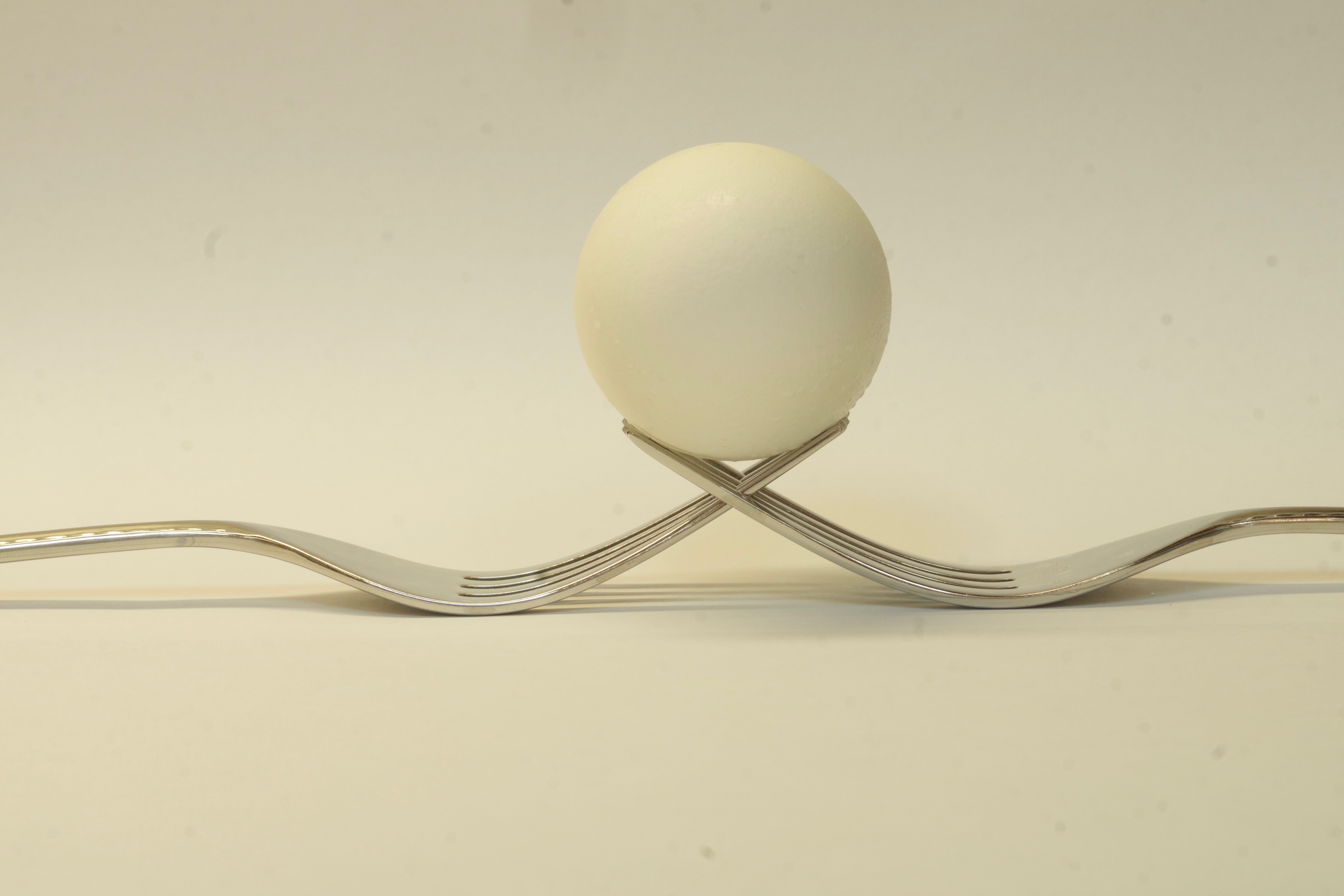
The choice of lens was based partly on laziness and lethargy (That lens was already on the camera that I keep on my tripod in readiness for the wild critters that share their space with us humans. The other considerations were:
Lens sharpness and closest focusing distance.
Limited but controlled (F/10) Depth of field My out of focus backdrop was two slightly overlapped sheets of 8 1/2 x 11 Inkjet printer paper about 5-6 inches behind the egg. (At a subject distance of 3.5 to 4 ft from the lens front element, the DOF of a 210 mm lens is plenty short ) Photopillls shows DOF of of 1 inch at 5 ft from the plane of the sensor using a 210 mm lens @ f/10 on my A77 1.5 crop sensor body. Had I checked that out before taking the photo , I might have done a few things differently (Perhaps F/13?). None of the other lenses in my quiver would have allowed me the perspective and distance compression of a moderate (210 mm) telephoto (My most used lens trinity is Tokina 11-16, Sigma 17-70, Sony 70-400.) Sorry but I earlier misidentified the lens as a Sony 100-400. It is actually a 70-400 Sony for “A mount” cameras. I’ve been studying up on A Sony a7rIII (e mount) camera body and the e-mount equivalent is the 100-400 ( so that was on my mind) Depending on it’s zoom setting my 70-400 lens’ maximum aperture varies between F/4 and F/5.6. It’s minimum aperture is constant at f/22 throughout it’s zoom range
RE: using a long lens for control of DOF That is problematic. A close up with a WA lens that shows the subject as the identical size image projected onto the sensor as does a telephoto from farther away will have virtually the same DOF. But the perspective will be different. (Awkwardly stated – read it very carefully) (I have to support that statement because it runs counter to commonly held beliefs — self appointed experts dispute this even though the lens designers know it’s true). Check out the F/5.6 DOF tables for a 20 mm at 2 ft (8 inches)and a 200 (20 x 10) mm at 20 (2 x 10) ft (8 inches). Assuming equal f stops, equal sized images projected onto the sensor produce equal DOF regardless of the focal length of the taking lens. An interesting corollary is that (given equal projected image sizes onto the sensor and equal f stops ) DOF for a crop sensor and a Full frame camera are equal. The image on the crop sensor just occupies a greater percentage of the dimensions of a smaller sensor
Graham, There were several factors that influenced my choice of aperture:
- I had the camera on a solid tripod so shutter speed became irrelevant.
- Even at 210 mm focal length setting on the zoom lens the depth of field was a concern. I wanted the farthest fork tine to be sharp as well as the shell texture on the nearest part the lens. At 210 mm my widest aperture was F/5.6. but the DOF was questionable I chose to go with a smaller aperture (F/10) in order to gain more confidence that the DOF would be great enough to capture the image I envisioned. As it turned pout the egg shell’s texture was lost in the highlights BUT it still, IMHO , works as a photograph even without the eggshell ‘s texture This Sony G lens is so sharp even wide open, that stopping down to gain sharpness at the lens’ sweet f stops , is almost redundant. So stopping down to f/8 to f/11 for extra lens sharpness as I would for my other lenses was deemed unnecessary in this instance. That’s my thought process behind choosing F/10.
Jasenka,
RE playing with color balance, here was very little color in the scene but the color temp of the lighting was a tad warm. Heres a color image without post processing. I thought that the cool coloring of the filter I found in Apples’ Photos App. enhanced the feeling of the photo.
Thanks for the responses. I respect the opinions expressed and the expertise behind rthe comments. I tried to “make a silk purse put of a sow’s ear” but that degree of alchemy was beyond my reach. The geometry of the scene does not allow for a critter level shot. The viewing angle is fixed and the sunken garden with raised flower bed in which my wife placed the fountain is not conveniently changeable. I had doubts when I took the photo . Those doubts were confirmed when I first saw the photo on my computer screen. I’m trying too hard to salvage a photo that should be relegated to the “record shot” category.
Thanks, Sharks, for confirming that my misgivings were real.
Beautiful shot. IT conveys a feeling of peace and contentment that everything is as it should be in God’s world. Commdnrts about lightening/ darkening the overall photo reflects individual personal preferences. The correct tonality is what YOU want it to be. IMHO the person makes the photo. When I try to imagine the photo without the person the photo becomes just another snapshot of a pretty sunset without the implied story. I do have a slight tension though, trying to decide if the person is standing on the rock or is wading in the shallow water. I don’t know why but it makes a difference to the story for me. Changing the camera height either up or down would have clarified the story for me.
I don’t understand the request to limit comments to technical issues to the exclusion of artistic values. The technical choices that the photographer makes are dependent on the artistic values that the photographer wishes to convey. Thus any discussion of technical issues is meaningless unless it is made with knowledge of of the photographers artistic intent. Why was the picture taken? What compelled he photographer to document the scene? Then armed with that knowledge, a discussion of the technical issues the photographer used starts to come meaningful.
Sorry! after I edited the photo and uploaded, I could no longer add any words.
Your Profile says it’s OK to download and edit so I did. I cannot figure out the lighting. overhead overcast? If the legs and bottom of the foot are in shadow, why does the body not cast a shadow? Was this a composite image?
In Apples very basic editing capability built into their Previews App , I darkened the lights, lightened the darks, lowered contrast overall and then reduced overall exposure . I’m still bothered by the haloing around the elephant’s left leg. I feel that this edit is closer but still not cigar worthy.

I rarely see a photo that I cannot think of some way that I would do something different But I cannot think of anything that I would do differently with this one. Print it large and hang it prominently, I deserves to be seen .
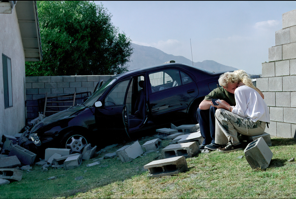
Great shot Lenny. Your creativeness never ceases to amaze me. I knew right away that there was something that bothered me with this photo but I had to mull it over for a few days before I could put it in words. It is the shark tank after all so-0-0-0: I think that if this were my photo I would crop out the bottom up two steps and/or selectively dodge the stairs just a bit (1/3 to 1/2 stop) Somehow the bulk of the dark steps seems (IMHO) to compete for my attention with the light and soaring lines of the mirrored building. As a secondary focal point, they should complement the main subject , not compete with it
No one has addressed the direct questions that I asked
“Is there an adaptor that would work seamlessly with all my lenses? Would the A7r3 automatically switch to crop sensor mode when an A mount crop sensor lens is mounted on the adaptor.”
Jeff: Since this is the Shark Tank: At the risk of doing violence to your memory of the scene , try flipping the image right to left. Then the leading lines from the left would lead the eye into the mountain (subject?) and the tree on the right would block the eye from leaving through the right border. Might work! It’s worth a try.
PS only the slight dissymmetry in the tree and the small white floating object are clear visual evidence that this is not a digital manipulation Beautiful scene well captured but (as Rob has pointed out) the unflipped tree creates an non-contributory secondary point of interest and it’s visual weight creates a teeter tooter imbalance of visual weights. Remember that my opinion is just an opinion and may be wrong for your perceptions. Its your photo , if you like it, then it’s a good one.
Jeff: Since this is the Shark Tank: At the risk of doing violence to your memory of the scene , try flipping the image right to left. Then the leading lines from the left would lead the eye into the mountain (subject?) and the tree on the right would block the eye from leaving through the right border. Might work! It’s worth a try.
PS only the slight dissymmetry in the tree and the small white floating object are clear visual evidence that this is not a digital manipulation Beautiful scene well captured but (as Rob has pointed out) the unflipped tree creates an non-contributory secondary point of interest and it’s visual weight creates a teeter tooter imbalance of visual weights. Rmemberfthat my opinion is just an opinion and may be wrong for your perceptions. Its your photo , if you like it, then it’s a good one.
-
AuthorPosts