Forum Replies Created
-
AuthorPosts
-
I would have no idea these are tiny. The squiggle of black in the background on the right is distracting.I would just try to fill it in with the lighter blurry background. (Clone it ). I miss the cooler! I do like the detail of the bud.
Here is an explanation
Into, like the second one because of a the better view of the island, but I do like the foreground of the first on. Both are beautiful scenes. (Crater Lake is not very remote which means more people can enjoy it).
I am only looking at your image on my phone, but I really liked it when I zoomed in and see the man up closer and only blackness of the window. Unless the graffiti somehow related to the man, I do not miss seeing it all. That man is a very interesting subject.
But, I would not want him blocked by the bench either. Was ther a third tent with an open green background? If so, that would have been another option. Great color!
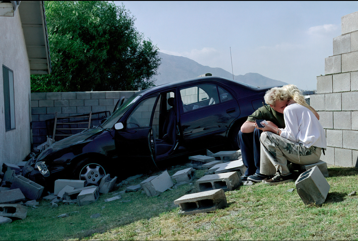
I would have preferred to have the man in red to be in from of the green wall. He blends in too much with the red background he is in front of.
Normally I would select the second one, because why take our eye away from the main subject including that corner without an interesting feature. But, I like that corner. It provides an interesting angle of the wall and interesting lighting as Tersha mentions. So, I choose the first image!
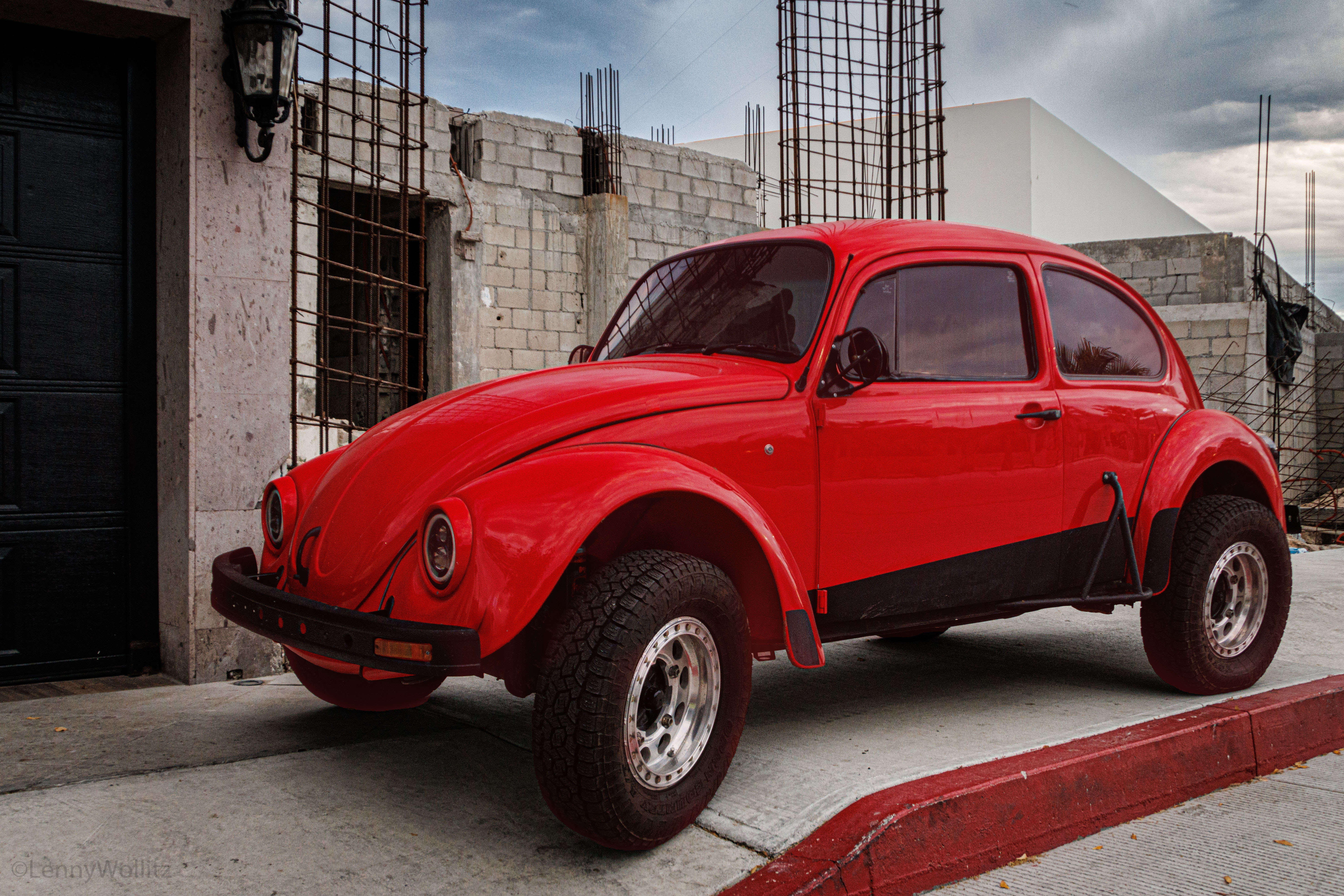
ou could select the subject in PS, they play with solid color fill. Probably because of the angle you took the shot (which I like a lot!) the front tire looks a bit big and a bit out of proportion.
Whoops
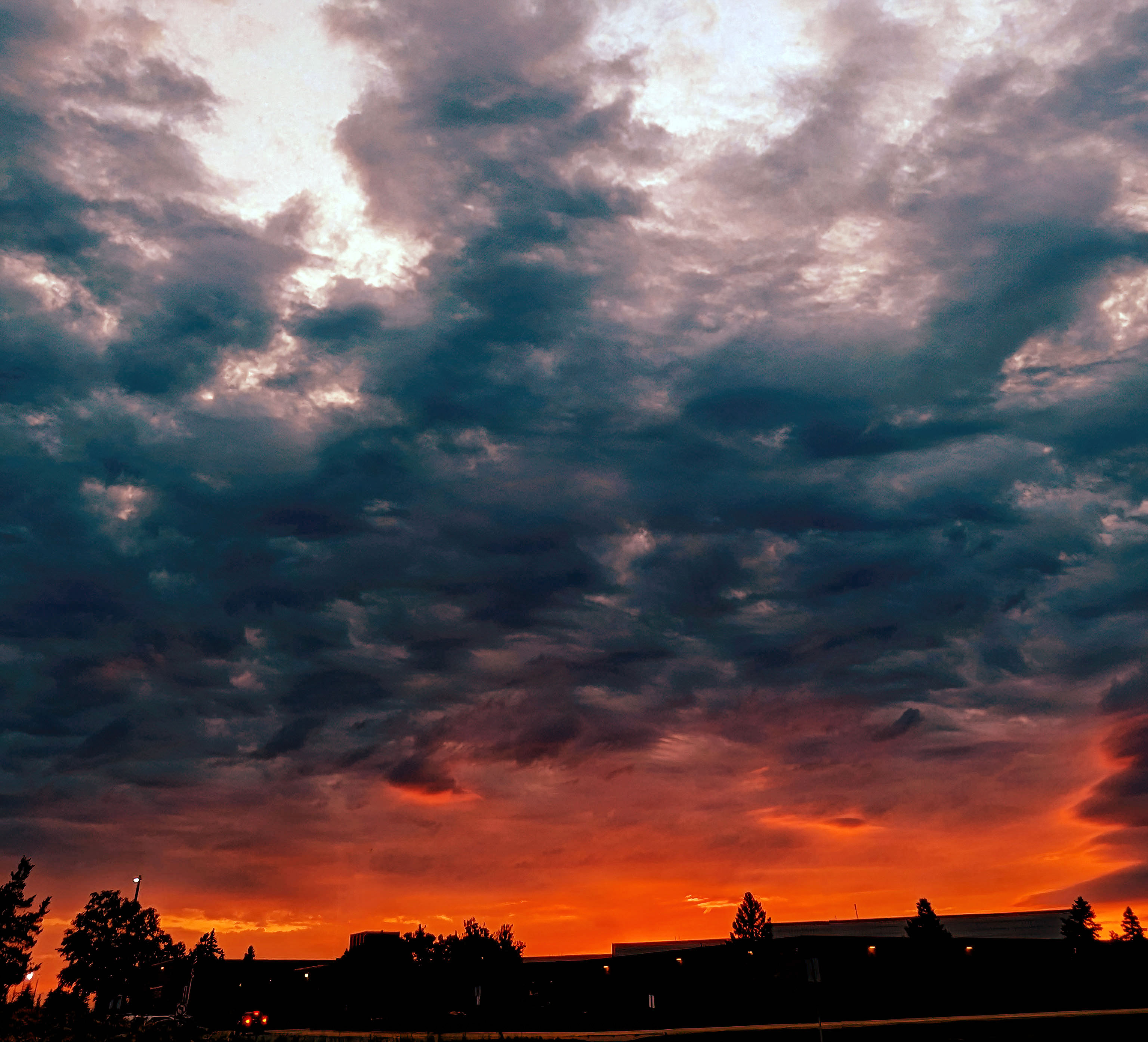
I would start with a curves adjustment layer and click on “Auto”I like the colors and that sky. I understand why you wanted to include as much as possible. In PS try a curves layer, start with “auto”. A boost of red hits the top of the sky. No right or wrong here, just play with the colors.

I would start with a curves adjustment layer and click on “Auto”I like the colors and that sky. I understand why you wanted to include as much as possible. In PS try a curves layer, start with “auto”. A boost of red hits the top of the sky. No right or wrong here, just play with the colors.
with flowers in direct sun, it makes a notable improvement with flower detail if a diffuser is placed in line with the sun. For ease of use check out diffusers that fold up and fit in your pocket.
Wonderful expression, and enjoy the tooth gap!
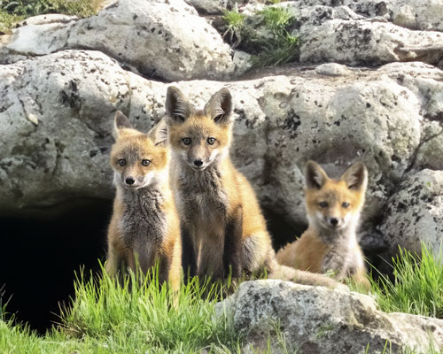
Great photo! I know this would not be allowed in a contest, but how about putting these animals (fox?) at the opening of their den!
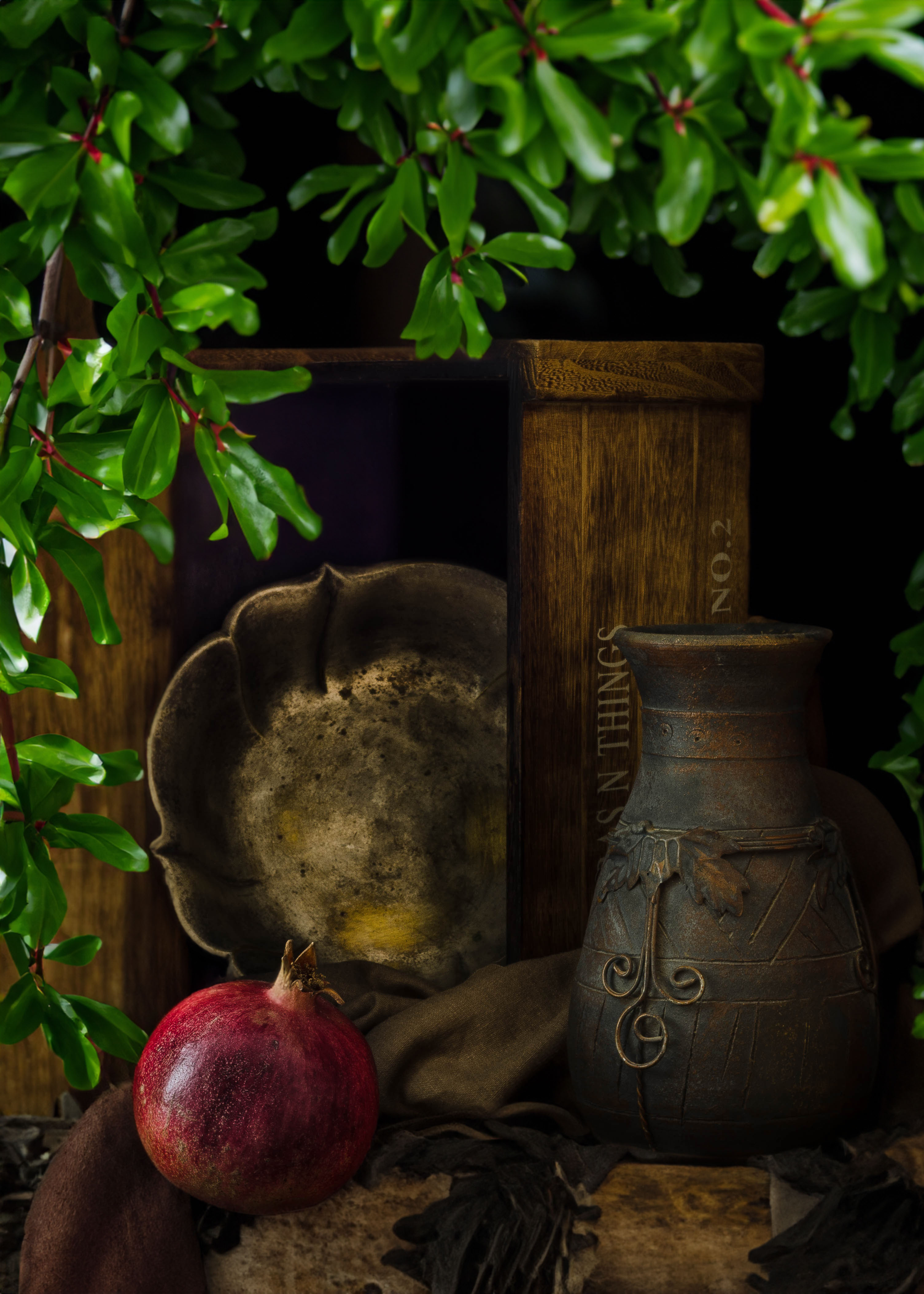
Hey, I put your excellent composition under a pomegranate tree.
Definition of banal “so lacking in originality as to be obvious and boring.”
Do you think your composition is lacking originality?
Did you just plunk the fruit down? Did you not move the base material the fruit sits on? Did you not consider how you worked the lighting ? Why did you take the photo? Can you really make a photo fo two peppers not be boring? Why no color?
In spite of how you judge yourself, I find a lot of thoughtful creativity in your photos. Now please go add some bright light on your next image!! Go look on the bright side of your creativity…
Why I think it works: Garlic does not have much color. so, why not use a sepia color that is an alternative to black and white. Sepia implies age to a photo and garlic hanging like this is common to any age and easily, therefore, it fits in the past. I can imagine this a photo from an old market place. For me, adding other colors would not improve the image of garlic.
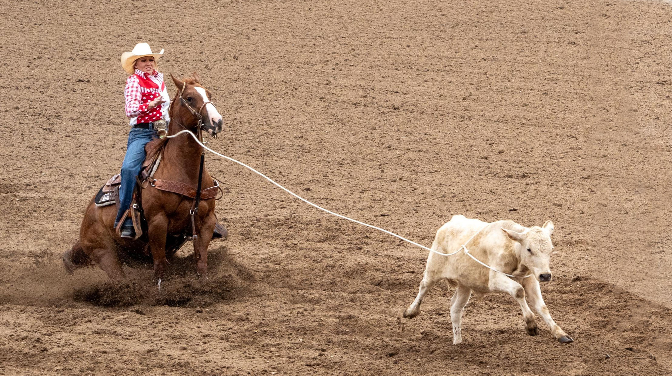
Here is a couple feet more to run! And yet, the end game is to stop that calf.
When bracketing do not forget to include ISO in your changes. With fire, boosting up ISO to 800 or 1000 might help freeze the flames and well as compensate for the surrounding darkness.
In hue/saturation, goto red, play with saturation and lightness. Play with hue for color shift. (tried for Jasnek’s suggestion, a subtle lightening boost)
-
AuthorPosts